


25 Apr 13
Responsive Web Design Sucks: Flexible & Fluid Grids
 Majority of the web design community are behind Responsive Web Design (RWD) and rightly so as this concept of web pages that adapt to the browsing device is most likely here to stay. You can find my last two posts in this responsive web design tools series here: Responsive Web Design Planning Tools and Responsive Web Design Text and Image Tools. There’s actually quite a few flexible and fluid grid tools for responsive web design out there, these are few that were very useful for myself and helped save time. Check them out!
Gridpak
Despite being in beta, Gridpak has potential to improve responsive workflow by generating PNGs, CSS and JavaScript for your responsive website layout. This has saved me some time in the past, give it a shot! 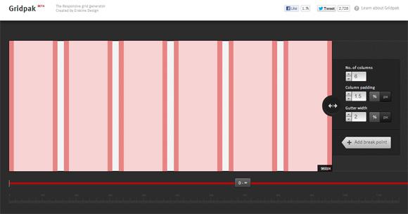
Semantic Grid System
Pre-processed CSS is very popular right now and this Semantic Grid System efficiently utilises it without bloating the code. It also lets you define column and gutter widths along with the number of columns. 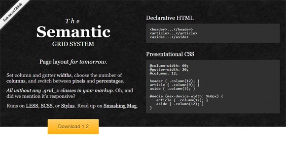
Golden Grid System
This system easily splits the screen into 18 even columns for responsive design. The leftmost and rightmost columns are used as the outer margins of the grid. 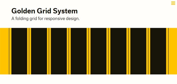
SUSY
SUSY is a grid system that creates a grid using no extra mark-up or special classes when creating fluid grids. In that sense it is almost similar to the Semantic Grid System mentioned earlier. This tool is great for Sass users. 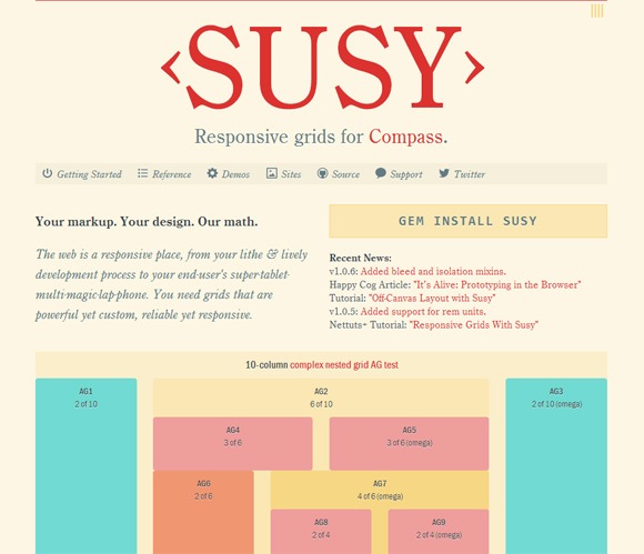
A Better Photoshop Grid for RWD
This grid system uses a 1000px base, making calculations for percentages very easy. I’m sure you’ve run into the .3333333% problem like many web designers have when dealing with percentages. There’s the PSD and demo included, Photoshop users be sure to check it out. 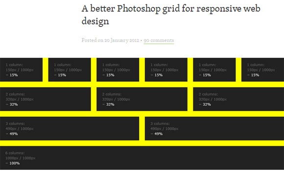
RWD Calculator
This calculator is fantastic if you use Photoshop for a preliminary design. It’ll definitely help you get started with your responsive website, just plug in your pixel numbers and away you go. 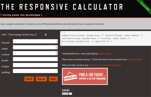
Columnal CSS Grid System
This grid tool is based on the 1140px grid system and 12 columns. The sketch sheets and CSS templates that come with the Columnal CSS Grid System are great time savers. 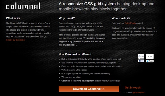
Gridset
Gridset is a very recently launched app and is definitely worth the 30 day trial. You can create grid sets, save them, manage them and integrate them into many projects. The advanced algorithm provides every possible column configuration for a given layout and provides you with a simple set of classes. 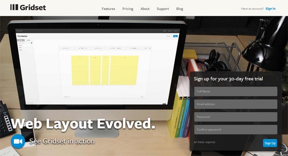
ProtoFluid
This tool isn’t a grid system, but I decided to include it for quick prototyping for adaptive CSS, fluid layouts and responsive web designs. 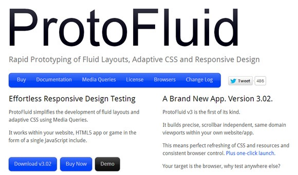
Conclusion
Remember these tools are not meant to be used together with each other, these are some of the resources that helped me during responsive web design over time. Hopefully, some tools in this collection will help you as well. Any tools I left out? Please let me know. Stay tuned for more responsive web design resources (like boilerplates, plugins, mediaqueries…etc) in this series!
