


17 Mar 13
Responsive Web Design Sucks: Image & Text Tools
 Nearly three years ago an article on A List Apart titled “Responsive Web Design” sparked an absolute storm in the web design community. The increased difficulty and time required to accomplish responsive web design is why it sucks! Responsive web design is probably here to stay at least in the foreseeable future, this series of posts provides some insight into useful resources that hopefully aid designers and developers. What you really want to look for are ‘truly responsive websites‘, that are able to adapt seamlessly across all screen dimensions, and not just a set few. You can find part one here: Responsive Web Design Sucks.
On fixed width web designs, images and text were all completely static and required relatively little to no effort during implementation. Not so with responsive web design! Here are some helpful tools.
Adaptive Images
Adaptive Images by Matt Wilcox detects your website users’ screen size and automatically creates, caches, and displays device and screen-size appropriate versions of your web page’s images. The great part is there is no mark-up changes needed. 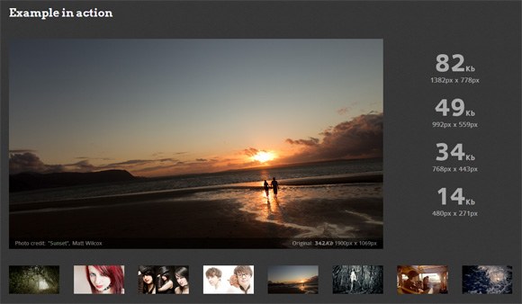
Picture Fill
Alternatively if you require a plugin that serves up appropriately-sized versions of an image to a user’s device, negating the need for mobile phone users to download unnecessarily large assets. Picture Fill by Scott Jehl is very useful, all markup pattern and explanations included. 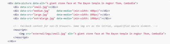
Filament Group Responsive Images
A free and experimental mobile-first image tool that scales responsively from Filament Group. You can download the files and follow the detailed instructions to reference the javascript here – Responsive Images. 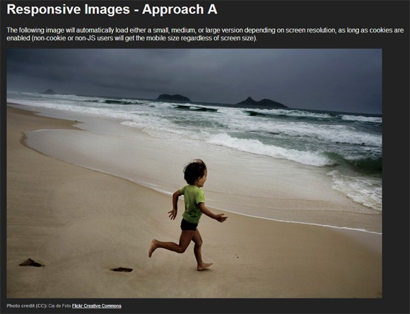
Seamless Responsive Photo Grid
Displaying images edge-to-edge can be a real pain when creating a responsive website, especially when the images are different sizes but need to maintain their aspect ratio. Here’s the perfect tool from CSS Tricks – Seamless Responsive Photo Grid. 
FlexSlider 2
When it comes to image sliders the web is saturated with them, but there are currently only a handful of free responsive image sliders. Our favourite is definitely FlexSlider 2 from woothemes as its complete with slide effects and fade animations, works with all major browsers. 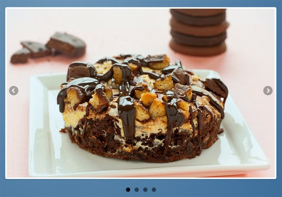
Retina Images
This tool by Jeremy Worboys is an absolute must when listing tools for responsive web design currently. It serves different images based on the device (retina screens) being used. The setup is simple and fallback regular images are displayed with high-res isn’t available. 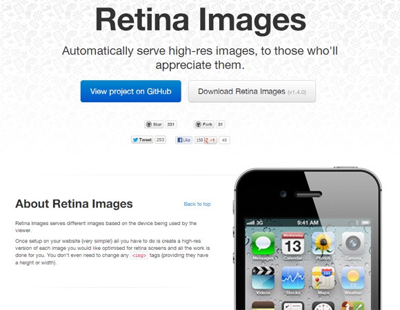
Prototyping Responsive Typography
Viljamis is well known in the web design community, this instructional article is more of a resource rather than a tool. Very detailed article that has many great tips about choosing font faces, font scales, sizing type, leading and white space. 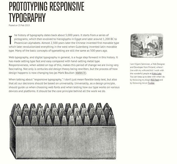
FitText
This jQuery plugin makes font-sizes flexible for your responsive design. This one is for titles, headlines and large text display thanks to Paravel. Details and downloadable from Github – Fittext. 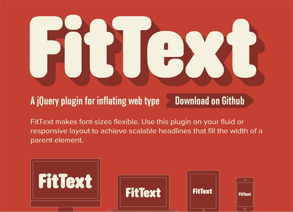
SlabText
This script uses the above FitText plugin, but splits headlines into rows before resizing each row to fill the available space. It calculates the ideal number of characters to set on each row by dividing the available width by the css font size. It all sounds very complex, but it really is a simple solution to big, bold and responsive headlines – see the SlabText demo or download SlabText. 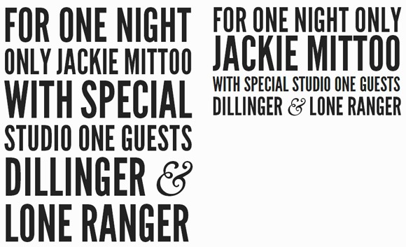
Responsive Images and Text
Utilising responsive images and text to its fullest can deliver some of the most stunning websites on the web, I recently showcased 26 awesome examples of responsive web design on noupe.com. Did I miss out one of your favourite responsive image and text tools? Let me know what you found helpful.