24 Mar 13
An eye for detail – A web designer perspective
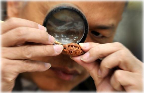 Here at Chromatix – Web Design Agency, we meet many different clients with varying briefs, wants and needs. When it comes down to design, these are the things we take particular care in considering whilst coming up with new fresh winning designs. These go hand in hand with some of the top web design trends in 2013.
1. Minimalism
A minimalist design emphasizes the contents of a website. Content needs to come first, so below are a few points that will help to create a minimalist website to show the contents:
- Use more white space (empty space) to clear out cluttered designs.
- Use large typography for gap fillers.
- Create more spacing between headings, paragraphs and paragraph lines.
- Put in large elements on page – buttons, icons, screenshots…
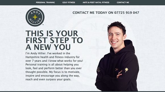 Use plenty of space and large typography to fill gaps.
2. Flat design
A flat design plays a part in creating a minimalist design as well. Below are a few points that makes up a flat design:
- Does not contain 3 Dimensional realism – remove gradients, bevels, emboss…
- Flat colours
- Simplified icons
- Colour blocks for layout
- Single colour typography
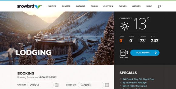 Example of a flat web design. Note the absence of 3D elements and use of colour blocks.
3. Typography
Good, creative use of typography is important to make your web design effective. To further describe the use of typography in the points mentioned above, below are some more key things that are quite commonly used:
- Large text – for headings, logos and point of focus.
- Highly decorated text for point of focus, main message and logo.
- Mixed fonts in one sentence – bold, condensed, thin, etc. Make sure that the fonts were chosen to complement each other.
- A single word or short phrases used as a description or Call to Action – buy now, call now, free demo are all great examples.
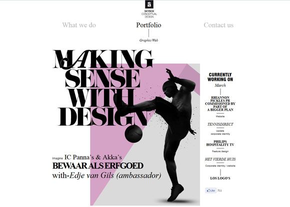 Example of a website that uses typography as the main design element.
4. Shapes
Website layouts are generally made out of a combination of shapes, either placed next to each other or spaced out. Below are shapes and uses that are more commonly used in designs:
- Circles – for navigation, call to action, icons and logos.
- Rectangles & squares – for colour or picture blocks, buttons, navigation, heading labels, to create an organised look.
- Other geometrical shapes – navigation, overlay on images and icons.
- Other organic shapes – Big shapes as the point of focus, stands out when placed with geometrical shapes.
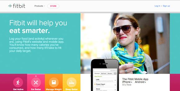 This website uses a combination of different solid shapes.
5. Big images
Having big images as part of a website creates a BIG feel to how your website looks. As retina graphics are gaining popularity, it is now possible to have big images in a low file size. You can check out these 80 large background websites for inspiration. A few ways to use big images in websites are:
- Backgrounds – image covers the whole screen background.
- Banners – large banners that cover a quarter or half of the screen.
- Single item – the big shape of a person or product that stands out from a single colour background.
- Image combination – the combination of a few cut out shapes from multiple images.
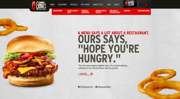 This website uses big images like how it is described in the points above.
An eye for design
There are many more points that need to be taken into consideration when designing a website. It is not just about following a trend. Good web design needs to be effective by creating a good user experience while not compromising on the importance of contents. So what are the other things, from your view, that makes up a good web design?
