21 Jun 13
Website Logos: Is Your Logo a Major Failure?
 Today we have a guest post from our friend Richard Eaves, digital specialist for Smart Traffic in the UK. Enjoy! Your logo is a key component in defining your business. Since it serves as the visual representation of your brand, it needs to stand out and be memorable. However, some companies tend to overdo or underwhelm when it comes to their logos. Even some well-known businesses have gone through major blunders when redesigning their logos. Take a look at the following ‘before and after’ images to see why some people perceived these as failures.
The Bad
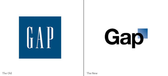 The image to the left is the original Gap logo, which was widely recognised. In 2010, a major redesign took place that didn’t sit well with people. In fact, the Facebook account of the company was flooded with negative criticisms. A Twitter account was also created in protest and a website called “Make your own gap logo” was made. After the public outcry, the company switched back to the original logo. More detail have a read at the guardian.
 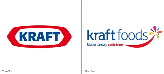 This shows a huge departure from the logo that most people associate Kraft with. First, it was renamed to Kraft Foods and a tagline was added to it. Instead of sticking with the distinctive red and blue colours, they used a more colourful mix.
  When the company split in two, the starburst logo saw its days end as well. The new logo put a small spin on the very first logo. This time, the letters are not all caps and feature a slimmer font. Sourced from an “underconsideration: brand new” article.
 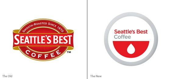 Seattle’s Best has been serving coffee since the 70’s and this resonated with their original logo. It was really vintage and invoked a cosy feel. The redesign, however, looked more generic. After looking through some of the not-so-good logos, it’s time to focus on some of the well-designed ones.
The Good
 When you look at the Toys R Us logo, you can immediately tell what they’re all about. Apart from the very obvious word “toys”, the colours and the font reflects the brand’s niche.
  The logo of Apple just shows a fruit with a bite taken out of it. Although it’s a very common food, the shading and the details help make it stand out.
  Twitter shows a good way of harmonising its company name with its logo. The founders came across the definition as “a short burst of inconsequential information, and chirps from birds”. Now that you’ve seen a bit of both sides, it’s time to look at the common theme across the successful ones highlighted here.
The ingredients
1) Simplicity
There is a saying that “simplicity is beauty”. It’s all about using minimum amount of colours and elements possible to produce a clean and uncluttered image that represents your brand.
2) Identifiable design
Your logo should be recognisable. Whether it is blown up to fit a billboard or shrunk to fit into an icon, it should always be identifiable.
3) Originality
A key factor to having a memorable logo is for it to be unique. If you’re going for a common shape, ask yourself what else you can do to make it different from the rest.
4) Clear message
Through your logo, you’re telling the public “This is who we are and this is what we do”. So everything from the shape down to the text should be able to reflect that. If you’re projecting a formal image, choose a formal font. If you’re a fun-loving organisation, show this in the colours and typography of your logo.
5) Medium compatibility
Always remember that your logo will not only be used on your website, but on other mediums as well, including flyers, calling cards, promotional items, social media accounts, and billboards. What looks good on your computer screen might not translate well in printed form. So make sure that your logo is recognisable even in different formats.
Conclusion
Your key goal is to get your brand recognised by people, and that is exactly what your logo does. It gives people an image they can associate with when looking at your brand. So keep in mind to come up with a logo that represents who you are and what you have to offer. Over to you, what do you think constitutes a good logo design? Share your thoughts through the comments.


