


15 Jan 20
Design QA for UI Design: Give it the attention it deserves
Amongst the many challenges and pain designers face in their day to day (“Just make it pop”), there’s nothing quite like the pain a UI designer feels when they’ve realised their project has gone live and is out in the public without them getting the chance to make sure it’s all up to scratch.
“Ah, well that’s definitely not going into the portfolio.” That thought has definitely crossed my mind many times over the years, before we started setting Design QA processes into place.
There are many reasons why the Design QA stage is treated like the middle child and overlooked. A few reasons include:
- Tight deadlines
There are always those jobs that need to be launched by yesterday, and in the battle of speed vs quality, there is usually only one winner. Design QA becomes seen as an optional “luxury” rather than a priority. - Lack of communication
In a digital agency, account and project managers generally increase efficiency by managing communication between the client and the team. Unfortunately, in the cases where there’s a lot of back and forth, lots of changes and a window of time that keeps getting smaller, someone may forget to tell the designer to check an update before the developer pushes a change live. - A “looks good enough to me” mentality
Not everyone has the obsessive eye for pixel perfection that a designer usually prides themself on. Sometimes the designer gets told to stop nitpicking and assess a build with mercy. Between the pressure of time and not wanting to be that demanding guy, corners may be cut.

So what exactly do we mean by Design QA?
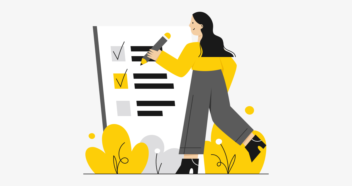
Design QA (Quality Assurance) is the process of reviewing code implementations of the product design to ensure that the UI matches the provided design specs. This means looking at everything from layout, colours, fonts, element spacing, interaction and animated transitions.
Where does Design QA sit in a standard project workflow?
Generally our projects look a little something like this:
- Planning/Wireframe
- Design
- Design-Development Handover
- Development
- Design QA
- Testing
- Launch
How to conduct an effective Design QA process
While the Design QA stage is often looked at as its own solitary dot in the timeline, the handover stage is actually a crucial stage in the project workflow that affects how intense your QA sessions are primed to look.
With all that said, here are some ways to optimise your Design QA process through effective handover and processes:
Use the right tools
I remember the days we used to give our developers flat JPGs of our designs and they had to build while eyeballing it. Yikes. They did a great job considering what they had to work with.
Nowadays, we have tools such as Invision Inspect and Zeplin which gives developers access to all the pixel dimensions, fonts and colour specs that they need to build pixel perfect products. Providing more information earlier means less room for errors, hopefully minimising all the little things that designers need to pick up in the QA stage.
Be thorough in your handover
Prevention is the best cure – dodge those time waster tasks like you would a cold. The more detailed you are in your handover notes to your developers, the less you should have to suffer writing out tweaks like “the blue isn’t dark enough” or “the font size should be 14px, not 16px”.
Basic style guides that list out your document colours, fonts and text styles go a long way in giving both you and your developers a reference point to make sure everything is consistent throughout the product build. Failing to provide this places a lot of faith in your developer checking every single page of the product for every single specification. At this point, you’re just asking to write 20 extra lines of tweaks in your QA list.
Detailed design instructions are also crucial to ensure that you’re not making your developers guess how you want something to look or interact. Specifying how you want this paragraph of text to fade in, or how want a button to transition on hover, accompanied with helpful examples take the guesswork out of the build.
Prioritise your tasks
Now that you’ve been as descriptive and helpful as you possibly can, it’s time to look at what the developers have implemented. With your keen eyes of observation and pixel imperfection radar, you’ve likely flagged at least 20 things you want them to change immediately. This is where it’s helpful to group tasks into key areas, so that the developers can prioritise the most important fixes:
- Priority Fix
These items are very obviously different from the design spec, or blocks you from being able to accurately assess other parts of the design. - General Fix
Small spacing and sizing issues, fonts, colours, and other general tweaks that could fly under the radar of the less keen observer. - Extra Detailed Fix
The border colour that no one will really look at needs to be a touch darker shade of grey.
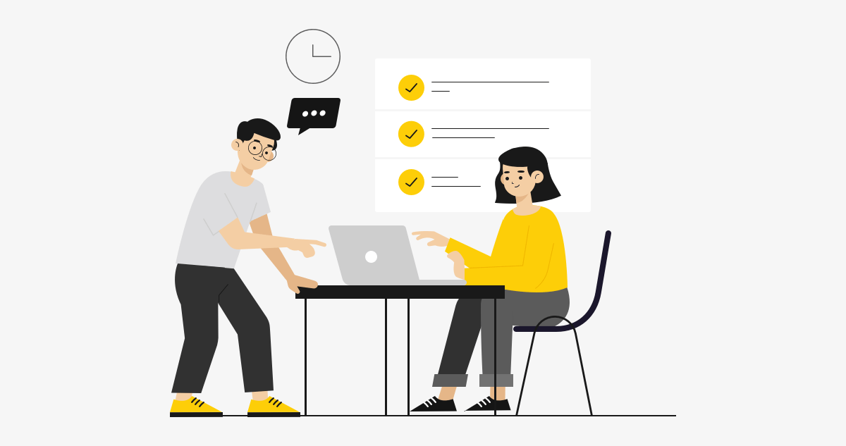
Be organised in your feedback
When writing your feedback notes, make sure you’re being clear, detailed and organised. I like to list all my notes in one place through task management tools like Asana or Trello, and group my notes into subtasks by pages and sections. Once I’ve finished with my list, I can then assign these tasks to the developers and they’ll tick them off as they go through each one.
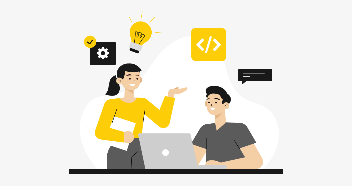
Be collaborative and communicate
This is arguably the stage where designer-developer collaboration and communication is most put to the test. Depending on the people involved, communication styles used and the method of giving feedback, the Design QA stage can either be the strong finish to the final stretch of a race, or a painful crawl to the end.
Sometimes the Design QA stage can feel like the designer is grading the work of the developer, and highlighting everything they did wrong and need to fix. If feedback notes are all over the place, comments are given without context and communication isn’t collaborative and helpful, this stage can start to really drag out and add tension and unnecessary time to the process.
It’s important to remember that the QA process is about polishing a hopefully already good build into something great, and designers and developers have to recognise they’re both teammates in the game to build something awesome, not average.

To sum it all up
Remember to be thorough in your handover process, and clear and organised in your QA process, with open communication and collaboration being prioritised across both. Design QA is a team effort, not a developer beatdown – When the whole team respects the roles each other has to play in this important process, you’re on your way to delivering some sweet, refined products.
Design QA is the middle child so often overlooked, but with so much potential. Give it a little love, and it’ll allow you to make sure your projects are delivered to a standard that you can be damn proud of.
