


04 Mar 13
Responsive Web Design Sucks: Part 1
Responsive Web Design is all the rage right now. It’s absolutely not surprising as it not only caters for different screen sizes and devices (tablets, phones, computers, laptops, etc.), but it’s simply really, really cool when you see a website’s design completely transform and morph into different layouts when a browser is resized. But to be honest, it sucks for web designers. It means more design considerations, a higher chance of error, more client requirements, more time and basically more work! Thankfully, there are plenty of useful tools for responsive web design already. This will be a series of detailed blogs that introduce some of the most useful tools to make designing responsive web design suck less for web designers. This week, I’ll be going through some of the most useful tools for getting started with responsive web design.
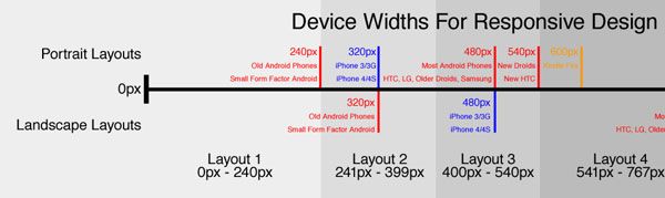
Device Planning Diagram
There is an ever increasing number of screen and device sizes to cater for with responsive design, deciding what the most appropriate widths to design for can be quite the challenge. Metal Toad came up with a simple device diagram for responsive design planning, which is a downloadable PSD with ideal widths for 3 layout to 6 layout responsive designs. This diagram is a MUST when starting your responsive web design, especially if your client’s project brief has specific devices and resolutions you need to cater for. I’ve used their suggested 3 and 4-width layouts many times. If you aren’t sure about which layouts to choose or have the flexibility to make your own choice, then I highly recommend trying their suggested layouts!
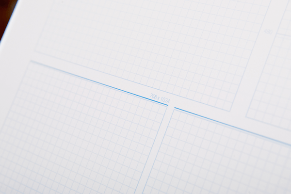
Responsive Design Sketchbook
Many great designers start with pen and paper, and mapping out a responsive site could not be easier with a multi-grid front page for thumbnail sketches and a back page that has breakpoint hints and pixel dimensions as well. Responsive Design Sketchbook is $12.95 for 50 pages of #60 bright white paper, spiral-bound; it looks awesome too, with a foil-stamped linen cover. This tool is likely a responsive web designer’s best friend during the concept stage of a project. The presentation of this product is very professional and would likely be something awesome to show off in front of your clients whilst talking them through your detailed responsive website ideas and vision. It certainly doesn’t hurt to keep all your responsive designs in handy sketchbooks as well. 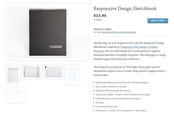
Responsive Web Design Sketch Sheets
If you’re after something free to sketch responsive design layouts and ideas on, these responsive web design sketch sheets from Jeremy Alford do the trick very nicely as well. These are not labelled with dimensions, which gives you the freedom to label or not label to your liking. There’s a notes section below the layout, which comes in handy in all sorts of situations. I highly recommend trying these out, as it sure beats drawing your own sloppy rectangles and looking a bit silly in front of clients or colleagues.
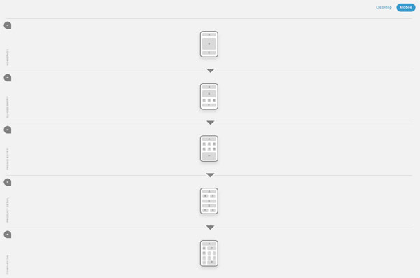
Responsive Layouts
Deciding on the layouts can be painful sometimes, and the last thing you want is to regret the design of a responsive layout after it’s been implemented by your web developers. Luke Wrobleski, an internationally recognised digital product leader, came up with this list of Multi-Device Layout Patterns. This is not a tool in the traditional sense, but it’s very valuable information and example layouts regarding layout patterns and includes many popular and effective solutions that can be applied to responsive web design. Note that he spent the time doing the research, which includes examples, saving us valuable time.
 If you’re looking for something fancier, then there’s Responsive layouts, responsively wireframed by James Mellers. Which is an experimental tool showing how complex desktop website layouts can be made responsive for mobile devices. There are some great ideas for responsive layouts here, and it’s designed and developed very nicely with only HTML/CSS. If ever you have clients who do not understand the benefits of responsive web design and layouts, this might just be the perfect place to take them and show off how impressive it can be.
 Remember that these layout tools only provide you with ideas; the best layouts for any responsive website obviously depend largely on the project brief and purpose of the website.
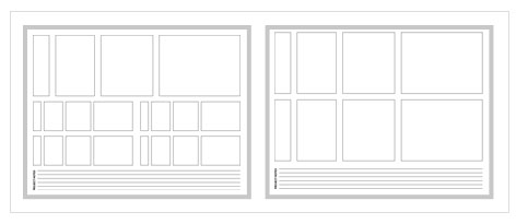
Responsive Wireframes
We’ve used Balsamiq for wireframing ever since the beginning of time, and our design team simply cannot live without it. Being the web design industry standard for wireframe mockups, it’s only natural for this wonderful piece of software to be 100% ready for responsive web design. This Responsive Design with Mockups article has absolutely everything you need from downloadable templates, real-world examples and a video tutorial! Whether you want to get yourself organised or if you have a client that demands planning perfection, this tool is amazing, especially given that responsive web design is only a recent trend. 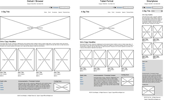
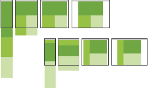
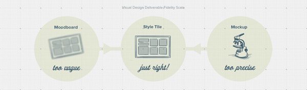
Style Tiles
Often, with responsive websites, it can be ridiculously time-consuming if a client requires several different designs to choose from or if you need to revise four layouts every single time after a design revision. Style Tiles is more of a design system than a tool. Marrying Style Tiles with responsive design is perfect as it fits flawlessly into the workflow, and it doesn’t imply dimensions or devices. The template is free to use and very adaptable. Give it a shot! This design system is not for every client, however, as there will always be individuals who require finished web designs before making decisive approvals.
Responsive Design Sucks!
Yes, it can be such a pain in the backside, but like so many have said, “no pain, no gain”. The end product is so often amazing, I don’t doubt that responsive web design will be trending more and more this year. Amongst us Australian web designers, it’s probably only just taken off, but to stay ahead of the pack, we have to stay on top of the technology! In the coming weeks, I will be detailing the use of responsive design image and text tools, frameworks, plugins and more. If you’re looking for a big list of responsive design tools, check out 55+ great and useful tools for responsive design, where you’ll also find some of the tools I mentioned above. What do you think of some of these tools I mentioned? Did I miss any?
