


04 Jul 13
15+ Effective Non-Profit Websites
 Showcases of different industry’s websites like our recent posts on great hotel websites and car websites demonstrate different and appropriate uses of web design techniques. So what makes an effective non-profit organisation website? The basic principles aren’t actually much different. Non-profit organisations are actually still selling something to their users. “No, hold up that can’t be right?” That’s right, all design is about selling. In the case of non-profit organisations they are selling a cause. There are obvious challenges because most of the time, there is no direct benefit for the user to buy into a cause. Just like any other transaction, non-profit websites have the challenge of convincing users to part with their time, money or resources. Let’s check out some great examples of non-profit websites.
LiveStrong
Formerly the Lance Armstrong foundation, a world leader in cancer support, fundraising and advocacy. The LiveStrong website has very strong branding with its iconic black and yellow and even stronger call to actions located in the most prominent position of the homepage. 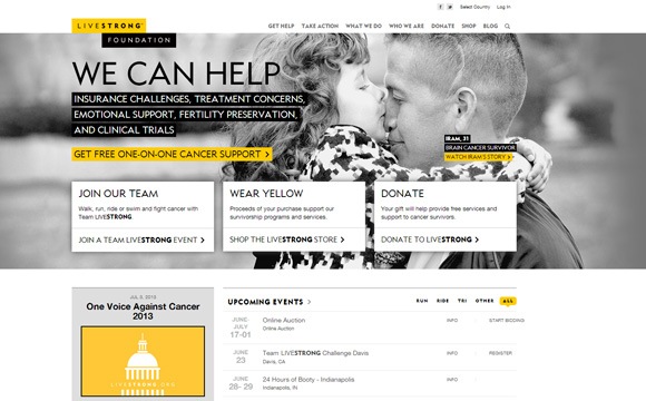
Smoking Takes Lives
Quit Victoria‘s recent campaign website that includes a true story of a smoking victim’s struggle. The imagery use of a real individual and his story, there is nothing more powerful than raw and up front presentation of the people that a non-profit is trying to help. 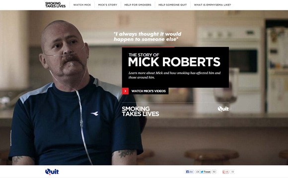
Head 2 Heart
A very creative way to advocate for the under privileged and exploited people in our world. This website is award winning for good reason as it creates an engaging and interactive platform to fund raise for a cause, which is Collyde in this case. 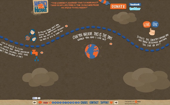
Invisible Children
Well known for the KONY 2012 campaign, the Invisible Children website is well laid out with prominent messages of their advocacy against the source of Africa’s armed conflict the LRA. With a clean flat design that leads users to all the important information and donation sections of the website. 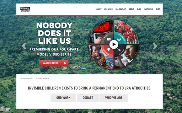
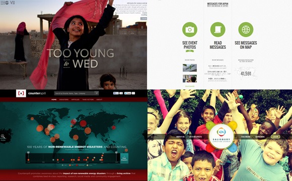
Too Young to Wed
Beautiful use of layered parallax scrolling on this website tells stories and explores the exploitation of marrying young girls in developing countries. The side menu is also well designed to promote its cause. 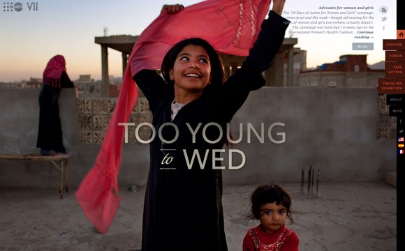
Take The Walk
Very simple yet effective layout and design. There is no harm in being clear and direct about a cause – “support the fight against poverty and HIV/AIDS in Africa”. 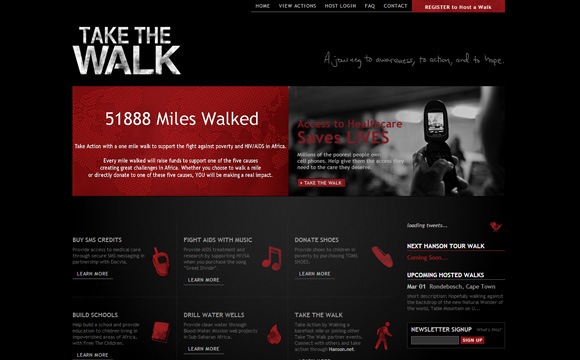
One
Extremely good use of large typography, high impact messages in bold text to convey the cause. Simple to use call to action of signing a petition against extreme poverty, as well as smart use of twitter hash tags like #endofaids. 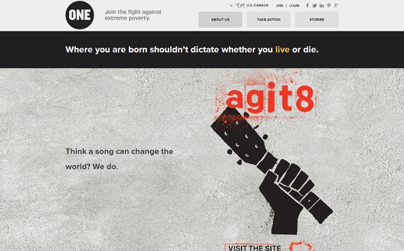
Charity: Water
Nothing fancy, just a simple clear message backed by powerful visuals. And a clear mission statement to top it all off “We’re a non-profit organization bringing clean, safe drinking water to people in developing countries.” 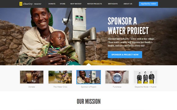
Counterspill
As web geeks we drool over the marvellous use of the latest browser technologies to promote awareness about the impact of non-renewable energy disasters. This is likely the benchmark for any non-profit awareness websites currently. 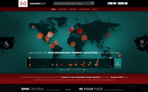
The Michael J. Fox Foundation
As a well known figure in the fight against Parkinson’s disease, the Michael J. Fox Foundation successfully use this prominent media figure in combination with well designed visuals and the result is this highly effective website. 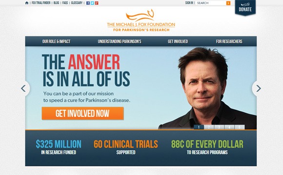
Greenpeace International
The Greenpeace website truly reflects their organisation, known for their blunt and aggressive stance on environmental issues. The constantly updated banner image is always of bold and simple design, convincing users to take action. 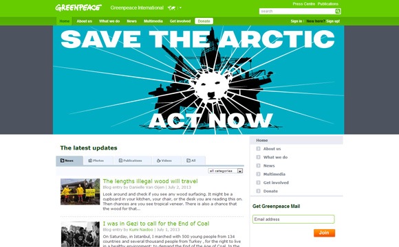
All we need is U
Volunteer Louisiana chose to use a photo competition to creatively raise support for their cause. The website cleverly utilises a rotating banner to convey it’s tag line and purpose. 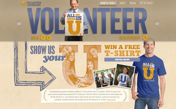
Messages for Japan
Although the Japan Tsunami tragedy is no longer recent, the innovative approach of this website is nothing short of brilliant and appropriate use of web technology. Using Google Translate to help thousands of people send messages to Japanese tsunami victims whilst allowing users to see messages on a world map – powerful in many ways.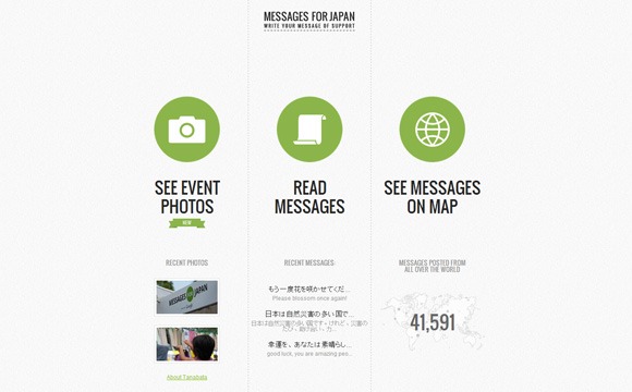
Salisbury Christian Church
Unfortunately churches are well known for boring and conventional websites in my opinion, however there are exceptions and this website is a great example of simple and intuitive use of screen space. 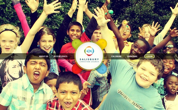
The Blogger Bake Off
Great execution of an unusual colour scheme. Very straight forward message and obvious choices for the user, this almost defines great simplicity in web design. 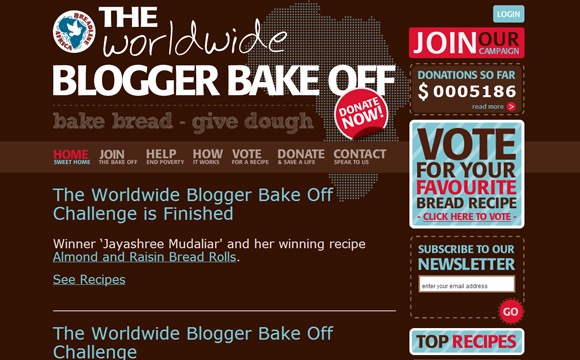
Change.org
The non-profit take on the Kickstarter crowd-funding platform. Despite the similarities with other crowd-funded websites, Change.org is undeniably well designed and is becoming the world’s petition platform. 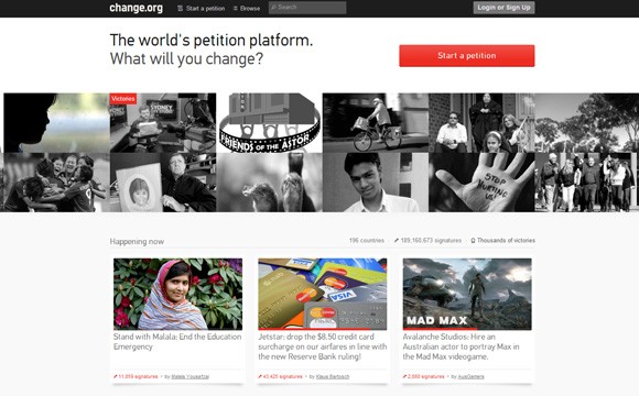
Were they powerful?
There’s no doubt that these non-profit organisations all have worthy causes, but which websites conveyed their message convincingly and powerfully for you?
