


07 Jun 13
Responsive Web Design Sucks: Boilerplates & Frameworks
 In some ways, responsive web design has regressed web design trends back to simplicity, flat designs, grid and box layouts. Some may argue that this limits creativity and innovation (especially in eCommerce website design), which is partially true. Given some time though I’m sure us web design/development geeks will find ways around constraints. There are already plenty of tools to support responsive web design, you can find my last three posts in this responsive web design tools series here: Part 1, Part 2 and Part 3. Boilerplates and frameworks are other awesome resources to cut down the time it takes to get a responsive website up and running. I’ll mention some of my favourites below.
Rock Hammer
Replacing the formerly popular boilerplate ‘320 and up’, Rock Hammer comes with typography, common HTML styling elements to give responsive web designers a head start. You can also check out the Rock Hammer sample page to make sure it’s appropriate for your project. 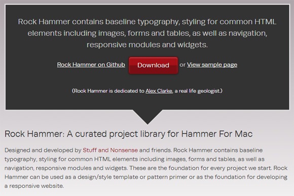
Skeleton
Skeleton is often our boilerplate of choice for mobile-friendly responsive development. It comes with an ideal amount of CSS files that help rapidly develop responsive sites. 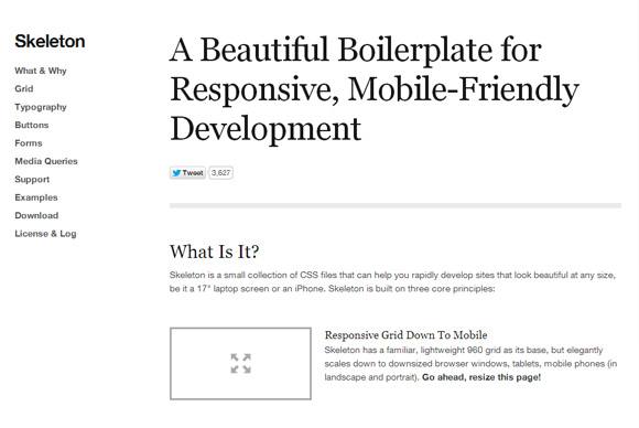
Wirefy
Many frameworks focus on layout and styles, whilst Wirefy is a content focused framework. Obviously, it’s great for content first responsive designs and projects. 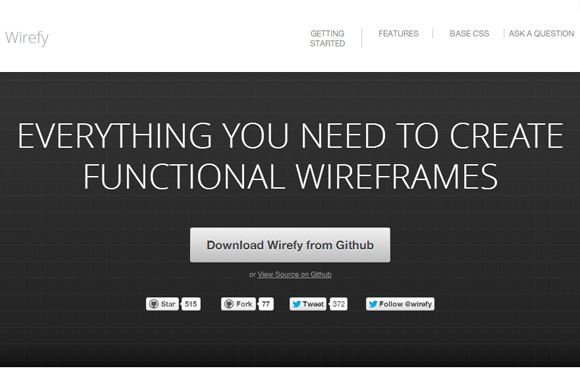
Mobile Boilerplate
Whilst this is a great boilerplate for mobile web applications, it comes with many useful mobile-friendly HTML templates as well as an HTML5-ready alternative to CSS resets. 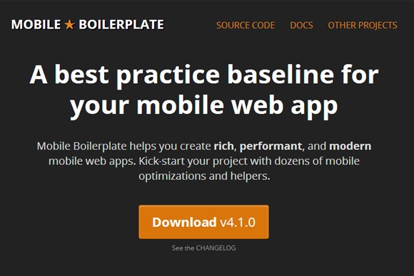
Bootstrap
A very powerful front-end framework that should definitely speed up your responsive web development. Many sites have been built with Bootstrap, check out some of them showcased here.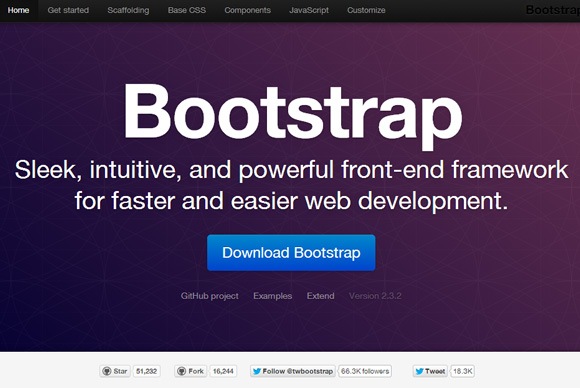
Foundation 4
Foundation is the most advanced responsive front-end framework. It is constantly updated and the features are so rich that there’s no point trying to list them out here. Pixar and National Geographic are amongst some of the big names that use this framework. 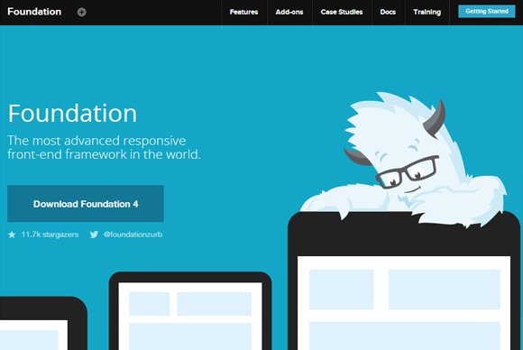
Inuit.css
This Sass-based CSS framework is based on a scalable custom grid system and contains the igloos plugin. In the recently released 5th version (March 2013) the framework was completely overhauled to be even more efficient. 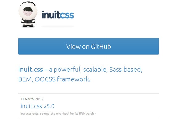
Gridless
An HTML5 and CSS3 boilerplate that has cross-browser capabilities and focuses on typography. 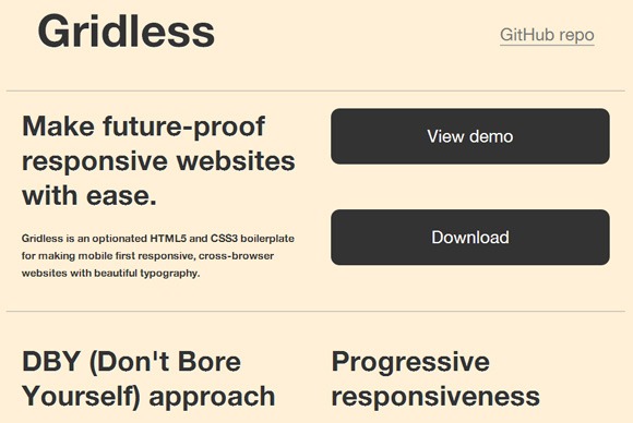
Gumby 2
Another framework built with Sass. Gumby is fast and provides many tools to quickly customize and build on top of the Gumby Framework. Highly simple and robust, this framework will likely see more use. 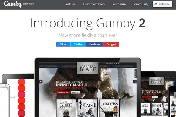
Singularity
Singularity’s unique point of difference is that it’s based on internal ratios instead of context-based, which allows for better gutter consistency across breakpoints. Ratio based also means that non-uniform grids can by in any unit of your choice. 
Less Framework 4
Quite a popular framework that has 4 layouts and 3 sets of typography pre-sets. It’s definitely simple to use, although not as powerful or complex as some of the other frameworks listed.
Finally…
So we are nearing the end of this responsive web design series, but there’re still plugins, polyfills, debuggers to come in the next 2 weeks! Stay tuned. Any cool frameworks or boilerplates that I might have left out? Leave a comment!
