


07 Feb 25
7 Valentine Design Inspirations to Try on Your WordPress Website
Valentine’s Day sneaks up on all of us. Before you know it, couples are hunting for last-minute gifts and you’ve got a website that still looks like it’s stuck in January. But here’s the thing — even with just a few days left, you can still make some smart design tweaks that’ll help boost sales, engagement, and heck, even a few impulse buys.
I’ve worked on enough seasonal web design updates over the years to know one thing: you don’t need a total overhaul. You just need to borrow what’s already working. Let me show you a few ideas pulled from brands that have nailed it.
1) Godiva
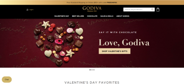
Luxury brands like Godiva know how to make a statement, and their Valentine’s Day designs always exude sophistication. The key takeaway? Use high-quality imagery, deep red and gold tones, and minimal yet bold typography to create an indulgent and high-end feel.
One stand-out aspect of their website is their CTA. It includes the phrase “Love, Godiva,’” which is a subtle yet effective way to mimic the affectionate closings of love letters.
Below the hero page, they highlight exclusive Valentine’s discounts alongside a curated chocolate box. Thus, this makes it easy for customers to find the perfect gift. This section is followed by their “Best Sellers” to ensure that shoppers can quickly access their most popular treats.
To implement this on a WordPress website, consider using a heartfelt CTA that adds a personal, romantic feel. Pair it with a well-structured homepage featuring a hero banner, a highlighted product section, and a best-sellers showcase to guide users seamlessly through their shopping journey.
2) Marks & Spencer
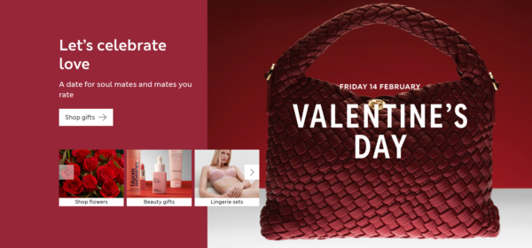
Marks & Spencer strikes a nice balance. Bold reds. Minimal distractions. The background stays light, so the product shots breathe. It’s elegant, but not trying too hard.
For your WordPress site:
-
Use deep red tones, but leave space — don’t drown everything in colour.
-
Subtle textured backgrounds work wonders.
-
Delicate fonts soften the mood without going full soap opera.
If you’re selling gifts, homewares, or fashion, this kind of setup keeps things romantic and shoppable.
3) Nordstrom
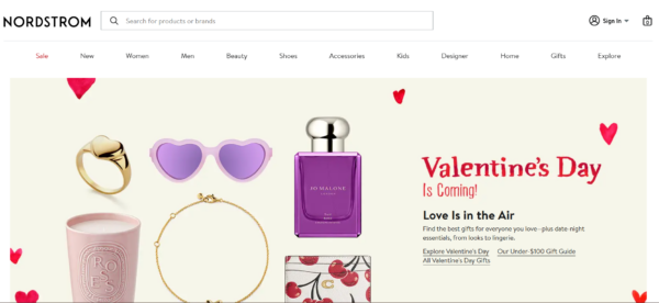
Nordstrom strips it right back. Big photos. Clear categories. Zero fluff.
-
Full-width, high-res product images
-
CTAs like Shop Valentine’s Gifts — right to the point
-
A light touch of red just to nod at the season
One client I worked with last year added a countdown timer plugin — I think it was called HurryTimer — just 5 days before Valentine’s. Conversions went up by 14% purely from urgency alone. Sometimes simple beats clever.
4) Pandora
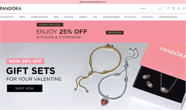
Pandora plays into emotions. Their slideshow says: Love the Little Things. Perfect match for their charm bracelets.
The details that work:
-
Bold reds and pinks, but always clean
-
Close-up shots with sharp detail on products
-
A white background to keep things feeling premium
It’s about selling emotion as much as product. If your business is in fashion, jewellery, or personalised gifts — this vibe works. Every time.
5) Target
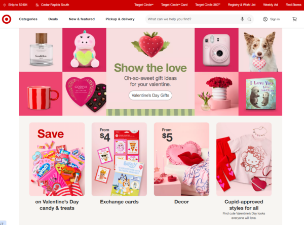
Target takes a fun and lighthearted approach to Valentine’s Day with cheerful colours, playful typography, and festive graphics. Their website features easy navigation and clear product categories to simplify shopping for Valentine’s.
Other business WordPress sites can replicate this by using bright pinks, animated heart elements, and bold, bubbly fonts. Adding a Valentine’s-themed banner and an interactive curated list of products can enhance engagement. This works particularly well for businesses that cater to families, kids, or casual shoppers.
6) Etsy
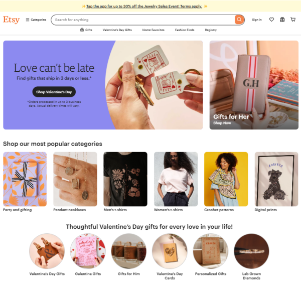
Etsy takes a different approach to Valentine’s Day website designs. Instead of the usual pink and red colour scheme, they focus more on messaging and their products.
They emphasised both convenience and personalisation in their web design approach. The hero section features the message “Love Can’t Be Late,” promoting gifts that ship in three days or less, catering to last-minute shoppers. This is accompanied by a ‘Gifts for Her’ banner, reinforcing the holiday’s gifting culture.
Below, curated sections showcase personalised gifts, trending deals, and budget-friendly finds, aligning with Etsy’s handcrafted and unique product offerings. The current website design effectively balances urgency with the platform’s signature artisanal charm.
7) Hallmark
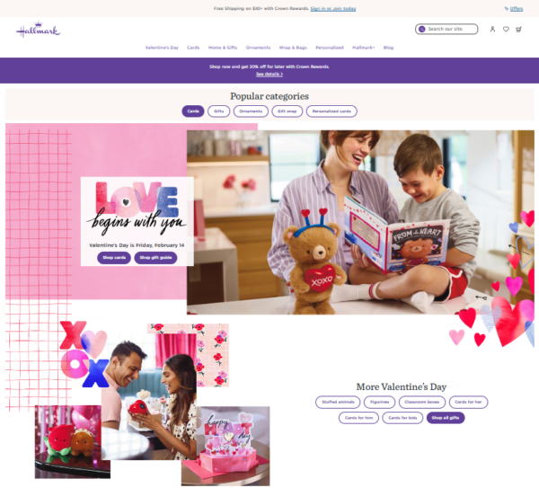
Hallmark goes straight for the heartstrings. They make you feel warm and fuzzy right off the bat.
-
A warm palette of reds, pinks, purples
-
Sweet imagery of people exchanging gifts
-
Handwritten fonts paired with soft graphics
One clever trick they do: prioritise categories. Cards, stuffed animals, figurines — all upfront, easy to find.
Don’t Overthink It — Just Start
Valentine’s Day is one of those times where a little design work can create a lot of sales momentum. Whether you go full luxury like Godiva or fun and playful like Target, the key is being intentional. And fast.
Need help developing and designing your WordPress site for Valentine’s Day and other seasonal events? Reach out to Chromatix today to boost your marketing efforts with a professionally built website.
