


15 Jan 20
Your Website’s Not Converting? – Here’s 6 Brutal Truths You Need To Hear
“A designer knows he has achieved perfection not when there is nothing left to add, but when there is nothing left to take away.” Antoine de Saint-Exupéry.
Taking a leaf from his book, we will highlight 6 most common web mistakes that frustrate users and increase bounce rate off of your site…often into the undesirable territory of your competitor. Interestingly, ‘conversion optimisation melbourne‘ is one of the most popular phrases entered into Google and fair enough. Whether you’re trying to rank locally or globally, this article will highlight conversion tips that will apply universally.
Camouflaged amongst the good, isolating what doesn’t work is probably the hardest task. If you’re looking at your online sales report with despair, you’re in the right spot. Open up your website (and your mind) and let’s get to work. This digital bootcamp is about honesty and tough love, but you’ll come out richer from it. Like a delicate microorganism; a website relies on everything to work together. Remove the tumours to let the healthy cells breathe.
Have you made it difficult to call you?
- Is your phone number hard to find?
- Is it nested on a subpage, 4-5 clicks down the line?
- Is it only on your Contact page?
Without a phone number that is always on the screen, you are closing the funnel of opportunity where customers can reach you. Raised on digital, millennials and most internet browsers will not tolerate mediocre or hard to find.
Forcing a user to scroll all the way to the footer on a lengthy page, on their mobile to find your number, is like placing a Help Desk at the end of a maze. Doesn’t take a wayfinding genius to know that’s not ideal. Statistics from Clicktale analysing 100,000 page views found that only 22% scrolled all the way to the bottom – that’s 78,000 users who did not get your number.
If you went on a great date, but didn’t leave your number, was there a point?
Not only this, a lack of visible phone numbers decreases the level of trust associated with your brand – it can paint a picture of an offshore office with dodgy connections. Maybe you removed the phone number because you got too many complaints. Maybe you removed it cause no phone number, no responsibility right? Highly unlikely, but hey people like jumping to the worst conclusions. Often burnt by previous bad web experiences, users carry these assumptions across until you can build their trust.
There’s a fear that when they run into issues from your product or service that they can’t call someone to vent and to fix the problem, that there’s no accountability. If you’ve nothing to hide, then don’t hide your phone number.
Is your website too slow?
- Does your website take 5-7 seconds to load?
- Do images load in strips as you’re scrolling?
- Do you have a lot of videos?

White loading screens are the welcome mat to a poor user experience. First impressions count, so starting off on a…slow foot is not the way to win over your users. With 63.4% of users browsing on their mobile, many are in-transit, in between train stops or on their coffee break. You get the gist. Time-poor and in a rush, if you take too long to set up the stage, your message won’t even get heard, with 22.2% of users leaving a website if it didn’t load within 5 seconds. Brutal.
Is there a point to having an awesome website, if people don’t even stick around to see it?
Aside from users leaving you, Google also rates you poorly for slow site speeds. With Google pushing you down the ladder, this directly hurts your search rankings, reducing the traffic to your website. Double burn.
Decreasing your site load speed can be as simple as reducing the size of your images. An unexpected villain, but large images are often the cause of slow site speeds – especially when people drag and drop photos straight from their phone. Original images are quite chunky, easily ranging between 5mb – 15mb. 5G is fast but still not built to accommodate that kind of size. Trim down the size of your images with this helpful tool – https://tinypng.com/.
Increasing site speed makes for a more seamless and enjoyable user experience. Watch that bounce rate decrease immediately (unless you’re a jumping castle party hire).
Do you have essays of text?
No one likes a waffle, unless it’s golden and drizzled with honey. In the digital world, waffling on is pretty much a crime, with poor engagement and high bounce rate the deserving punishment. Big blocks of text date back to the long Powerpoint Presentations in the 90s – and that’s where it belongs, in the past. They’re overwhelming and require a great deal more concentration to get through.
Time is of the essence for many internet users (particularly Gen Y, Gen Z & millennials), so if you can’t present your message in digestible chunks, it isn’t even going to make it to the tasting plate.
Although you might have a lot to say, repeat after me “My website is not a book. My website is not a novel. My website is not a thesis.” Websites are a quick introduction to your service or product, not the factbook or user guide. Don’t confuse the 2.
Your website is like your salesperson – you want someone succinct and straightforward, not someone who takes 10 minutes to get to the point. Pretty sure you’d leave too, if a salesperson took 10 minutes to explain something. Yawn.
- Make your message short and clear.
- Do have engaging bold headlines
- Do have 2-3 very short paragraphs
- Do have 3-4 bullet points for each section
- Do have a good amount of white space around your text
Do you use a lot of stock imagery?
- Do your images feature a lot of cheesy smiles?
- Do your images have totally different colour schemes?

Images speak a 1000 words. But if your images are of the stock variety, I’d imagine all those words are the wrong kind. Not saying all stock photos are bad, but there is a lot that isn’t good. If you are going to use stock photos, you have to ensure the images you choose are not overused and align with your brand. But sifting through the junk to find the gold is quite time-consuming, time which you didn’t have and led you to download those images in the first place.
Most stock images look generic, cheap and tacky. These images are most likely not aligned with your brand and decreases your authenticity. This problem is amplified if you use a range of images on your site from different sets. Most digital natives (born after 1980s) can recognise stock imagery when they see it and will judge you subconsciously for it. You might have a wonderfully diverse and personable team, or a lovely workspace but who cares? The customer doesn’t, because they can’t see it. For all they know, you might be trying to cover up your offshore team and basement office.
The options are simple.
- Hire a graphic designer to customise your imagery and add the flavour of your brand
- Hire a professional photographer to shoot a set of photos you can use for your website and your marketing (win-win)
- Borrow an iPhone, a Google Pixel or a Huawei to take some photos yourself – natural light is your best friend
Like the saying “I’ll believe it when I see it”, giving the customers the chance to see what you’re really about, pushes them one step closer to believing what you want them to.
Do you use pop-ups?
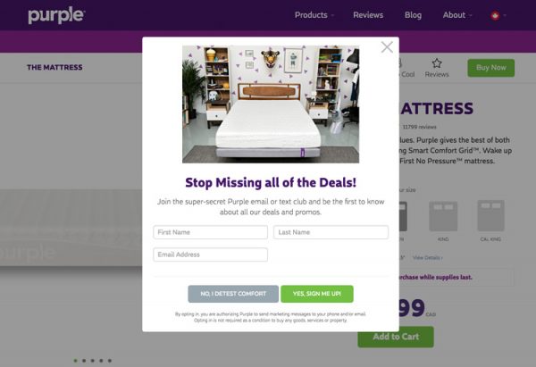
It is a long-standing debate whether or not pop-ups work or if they do little more than annoy customers. On the wide spectrum of annoyance, if your pop-ups are bad enough, they can scar a customer so significantly that they may never return.
Scarring ability high if your pop-up commits any of these
- Pops up immediately after initial homepage load
- Has a lot of text
- Doesn’t offer customer any value
- Your pop-up shows up religiously on every page
When your pop-up shows up within a second of the load, the user has not even warmed up to you and you’re trying to pitch a sale. It’s not proactive, just irritating. Introduce yourself, pour them a drink. Let them settle in and get to know you.
If there’s a big chunk of text, the user will not read it. Period. Much like how an unwelcome door-to-door knocker is allowed roughly 3 minutes, the pop-up is equally intrusive, so be brief and to the point (in digital time, you’ve got 5 seconds).
Pop-ups usually serve to collect email addresses and should have an incentive to encourage users to give it happily. Offer your users a discount or a downloadable resource to facilitate a more natural exchange for their email.
If a customer has already refused you, would you go up to them again and ask them the same question? You will literally shove your customers out the door if you badger them with repeat pop-ups – a user shouldn’t have to tell you again and again that they’re not interested.
Pop-ups can work… – with an average conversion rate of 2.9% they can help with building your marketing database (if you call 2/100 help). But they are dangerous territory to navigate, as they can piss off the customers who were willing to spend dollars with you.
Takeaway? Pop-ups can hinder more than they help.
Do you have a long contact form?
- Is your form long and tedious?
- Do you ask a lot of unnecessary questions?
- Is your checkout process longer than 4 steps?
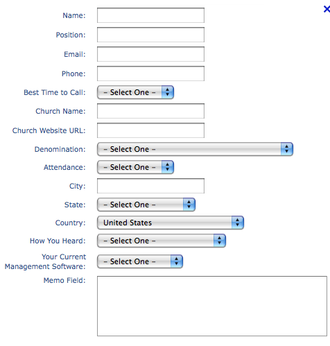
Source: https://3bugmedia.com
You want to celebrate your users making it to your contact form. The last hurdle. They’re entering their details. Sale in the door. Done deal right? Almost. About 77.4% of people abandon their cart halfway through the sale or fail to click the submit button on your contact form. While it’s natural that a percentage of customers get cold feet, you can optimise it to dramatically decrease this number.
Filling out a contact form should be as simple as possible. Every additional form field is a barrier between you and the submit button. You want your form to reflect you, to come across as approachable and easy. Ask 20 questions and you’ll come across interrogative and long-winded.
So remove all unnecessary questions or hurdles.
- Do you really need them to upload a picture of their drivers’ license?
- Do you really need their passport?
- Do you really need a second phone number?
- Do you really need a middle name?
Polishing off this last challenge brings us to the end of this digital bootcamp and a little bit of homework for you.
Hopefully after you’ve enacted all these small but effective changes, you’ll find a rejuvenated website that can finally perform to its true potential.
Better user experiences means happier customers.
Happier customers mean more conversions, which means more sales.
More sales leads to a busier you and less time for you to read articles like this… Wonderful!
How can we help?
We hope you found our tips helpful, and the little bit of homework that will transform your website not too difficult. As specialists in the web design field, digital is our language so give us a call if you’d like some professional advice. Call our team on (03) 9912 6403 for a chat.
