


20 Feb 20
5 Biggest Mistakes To Avoid In Ecommerce Web Design
Entering the wonderful world of eCommerce? Giving the traditional brick-and-mortar stores a run for their money, eCommerce is truly a great opportunity to rake it in, but there’s more than meets the eye. Many fall into the trap thinking eCommerce web design a simple set-and-forget piece that requires minimal attention ; if it sounds too good to be true, it usually is.
We’ve studied a variety of eCommerce websites, big and small. Pairing our observations with industry findings, we bring you a list of the 5 biggest mistakes to avoid when setting up your new online venture. Armed with this knowledge, your eCommerce store will stand a much better chance in the shark tank of online.
1. Do Not Overlook Security
With the welcome arrival of the internet and computers, followed the dark side of hackers, scams and viruses. Within the broad sweep of millennials to baby boomers, from the web-savvy to the tech novices, most are still educated enough to look for visual cues that reassure them a website is trustworthy.
As an eCommerce store, you ask customers for sensitive information, personal details and credit card numbers. Securing your website is key to protecting your website from unwelcome hackers looking to steal this data (and also customer lawsuits). You might think it’s okay to take a gamble, but your customers certainly won’t. In fact, a staggering 15% customers will abandon their carts if they feel concerned about payment security.
Security Action Points
- SSL Certificate will give you a green light from the URL bar with a ‘Secure’ reading.
- Display security badges prominently during the payment gateway

Security badge examples from ConversionXL
2. Avoid Messy Category Hierarchy
If you’re opening up a virtual shop with a lot of items on sale, you’ll want to ensure you consider proper hierarchy and taxonomy for the families of your products. You may know the nitty-gritty of your products and services back to front, but your customers won’t.
In the same way vegetables and fruits aren’t placed in the same aisle as dog food, you want to ensure your products are categorised so that it’s easy to understand and logical to follow.
This is also crucial if you’re getting into the SEO game – not setting up correct category families or product names right the first time can have serious ramifications later down the track.
Category Action Points
- Consolidate your product categories in a logical manner
- Name & organise your products in a SEO friendly way
- Create a sitemap & wireframe to check your structure makes sense
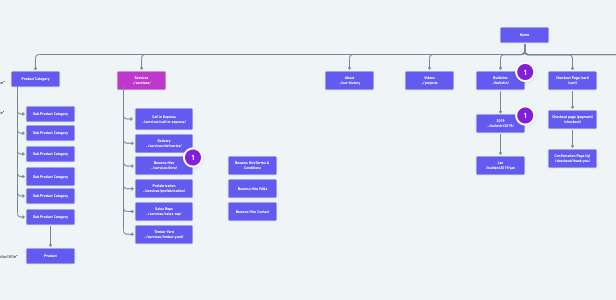
Example of a sitemap (Whimsical)
3. Is There A Lack of Social Proof?
When people are unsure about something, they often look to others’ stories or experiences to shape their own thoughts or expectations. An innate quality that runs deep within us, we rely on social proof to help decide whether something is worthwhile. Statistics show that 92% of consumers will read at least one review before buying something online. Nowadays, in the time of digital, word-of-mouth just doesn’t cut it.
If your product is really fantastic, you need to find others who also think so. Don’t toot your own horn, as everyone will see through that. Be sure to capture the customers that have enjoyed your services or your product, ask them to write a testimonial or give you a review. Maybe even throw in an incentive to do so; a 20% discount on their next purchase or a free sample should do the trick.
And whilst we’re on the topic, never fake your own testimonials. That is potentially an even worse crime than not having any testimonials at all. Self-written testimonials often look scripted, easy to spot, reek of desperation and make your brand appear disingenuous.
Social Proof Action Points
- Ensure there’s a healthy number of testimonials scattered through your site
- Sign up to receive genuine Google Reviews or Trustpilot Reviews
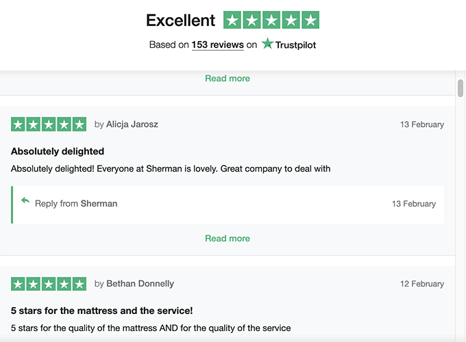
Example of Trustpilot reviews on an eCommerce website
4. Are You Hiding Your Contact Information?
Online stores are very different to the real world; customers can go in and out of browser sessions without being hassled by persistent sales assistant staff. It’s like a self-checkout service, and customers love that, most of the time. However, in the instance they do want some help or talk to a real person (chatbots don’t count), make sure you have a safety net to catch them. (And no, an FAQ page is not the solution). Your customers want to know that a real person will address them if they run into problems. Hiding your contact information will also deplete your company’s credibility and trustworthiness.
Action Points
- Have a Contact or Help page with your phone number or email address
- Display your contact information prominently in your header or footer
5. Do You Have A Long Check-out Process?
“Would you like to buy a water bottle for an extra $3?”
“Would you like to sign up to hear news about the charity we’re supporting?”
“Would you like to create a membership rewards account?”
“Would you like to hear about our other store promotions?”
Peppered with these questions when you’re trying to finalise a purchase is sure to fuel your frustration and take away from the experience. However, you’re at the register with your wallet out already, so it’s much harder to walk away. In the world of online, it’s very different, and it’s much easier to just abandon the cart altogether.
In fact, cart abandonment is already very common and high (a staggering 78.65% in 2017). So, you want to do anything you can to reduce the barriers stopping your customers from reaching the finish line (save the marathons for another time).
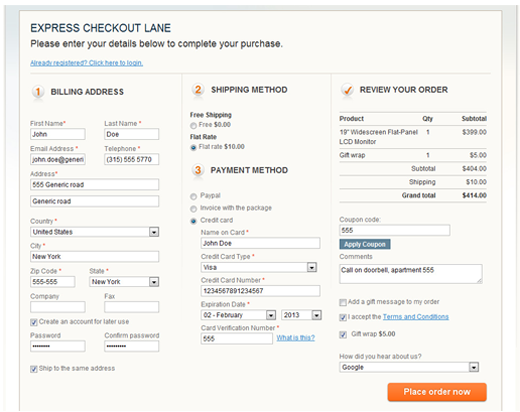
Example of a lengthy check-out form (Source)
Check-out Process Action Points
- Consolidate your check-out into a 3-4 step multi-page process
- Allow customers to check out as guests (who has time to remember account passwords?)
- Reduce any unnecessary form fields (you do not need to know their middle name)
You’re Ready To Get Started With Retail
Tick off these 5 things and your eCommerce store will be in much better shape. It might be by no means perfect, but remember that your website is a work-in-progress that can be continually optimised
- A/B testing
- Google analytics
- Customer feedback is a must
After all, many of these lessons have come from the eCommerce giants themselves; we’re all learning here.
If you’d like more of a hand entering the eCommerce industry, you can give us a call at Chromatix on 03 9912 6403 (and be sure to ask for Irwin). With a team of experienced UI/UX designers, dedicated front-end and back-end developers, we’re geared to do the heavy lifting so you don’t have to.
