


01 Jul 21
Best Web Design Strategies For Luxury High End Brand Websites
What Does a High-End Brand Experience Require?
To come off effortlessly as a high-end brand, regardless of the industry, there is one key thing you need to pull off well. Perception and reality need to match. Brand continuity is important in allowing a consistent customer experience to match from when they browse your website online, to walking into your store and engaging with your staff.
Take the brand, Apple, as a premium example. Known for innovation and futuristic technology, one can experience this across multiple touch points – from the concept-style retail store in Chadstone, their cinematic experience campaign websites all the way through to their modern, minimalistic matte-velvet packaging with the gloss finish.
Hubspot found that 38% of people will stop engaging with a website if the content or layout are unattractive. If you’re in the luxury space, this user percentile is even higher, as consumers very much value a consistent look and feel from start to finish.
Every touch-point of the user experience needs to match
- Brand association
- Brand perception
- Brand continuity
We specialise working with clients that are in the top 5% of their industry. Through captivating visual design, our conversion frameworks and straightforward user experiences, it is important for us to ensure their new digital experience matches the quality of their offering and ensure their website does not cheapen their brand. After all, 75% of consumers admit to making judgements on a company’s credibility based on the company’s website design.
Here we look back on a few of our clients and unpack four of our strategies which have helped elevate their foothold in the luxury space :
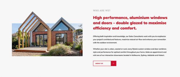
Rylock Windows and Doors
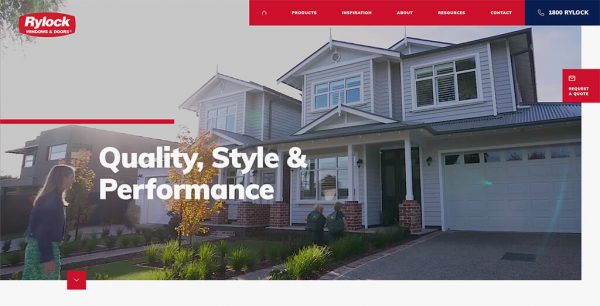
If You’ve Got the Assets, Flaunt Them
Rylock have built a wonderful reputation as renowned Australian builders over the last 35 years. With award-winning projects and a state of the art manufacturing plant, it was important to create brand continuity with a seamless digital platform.
Images are 60,000 times faster to process than written text. We took every chance to hero Rylock’s designer creations in a variety of visual layouts, balancing beauty with functionality.
We showcased the high architectural standard of their homes with 3D style cut-out imagery. We also incorporated a 2-column portfolio-style layout to show aspirational lifestyle imagery next to still shots and tie the two together. Minimalistic gallery sliders were also built in for the content sections that required more visual show-and-tell.
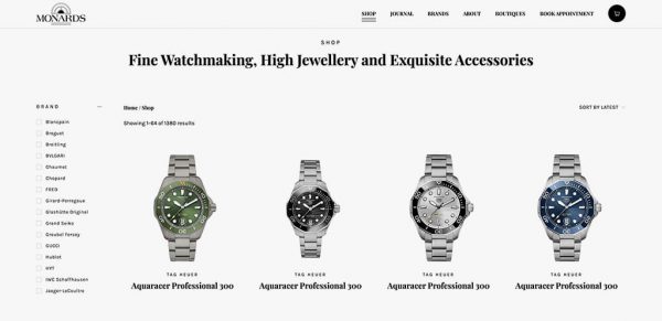
Monards (Crown Casino)
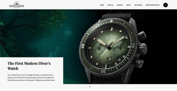
Executing Minimalism Well Relies on Good Foundations
It doesn’t get much classier than fine watchmaking and high jewellery. Tucked away in the refined Crown Casino complex and an entrance framed by towering golden doors, Monards offer a collection of exquisite pieces by renowned designers Piaget, Chopard, Longines, Bvlgari and a host of other word-class brands. Monards required a digital experience that mirrored their elegant in-store shopping experience. This is especially important in the digital age, when 81% of customers search online before they make a purchase in a physical store, as a study by Impact found.
Some might think you need to pull out the big guns for the big names. Videos. Animations. Micro-transitions at every stop. Parallax effects, etc. However combining all of these together can in fact result in a gimmicky website that dates quickly, like fast fashion or anything that follows a trend.
When it comes to timeless design, less is more. In truth, great design is not when you’ve finished putting in, but in fact when you finish taking out. With the Mondards website, it was about establishing good foundations with expensive-looking font pairings and clean composition.
The polish comes from the ample breathing room between sections and individual design elements, to allow the user’s eyes flow freely from section to section, without overwhelm. People remember 10% of what they hear, 20% of what they read and 80% of what they see. With beautiful photography of exquisite watches and diamonds in our hands, we kept the design minimal, to let the fine workmanship lead the stage as protagonist.
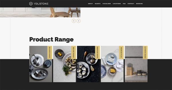
YDL Stone
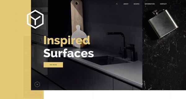
Add Finishing Touches Relevant to the Industry
YDL Stone is the designer’s choice for luxury quartz stone surfaces. As a supplier in demand, they often work with commercial architects or luxury home developers. Whether it is marble or stone, surfaces can look a little flat sometimes, excuse the pun. So it was our challenge to elevate their range and appeal to the high-end spectrum of the builder’s market.
An Adobe study found that given 15 minutes to consumer content, 2/3rds of people would rather read something beautifully designed than something plain. As YDL Stone are in the architectural space, it was a great opportunity to explore and incorporate structural lines and shapes to add polish to a sleek open grid layout.
Small structural elements add interest and elegance in framing content
- Hexagonal gold iconography that elevate the branding
- Thin vertical lines inspired by architectural drawings which resonate with their target market
- Elegant homewares add classy detail to highlight the wealth of the intended homeowners
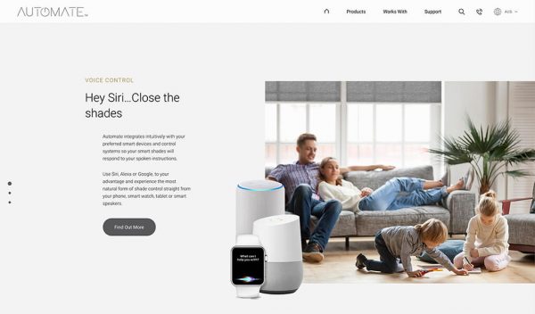
Automate Shades
https://www.automateshades.com/au/
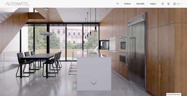
Content Design is an Important Component in Visual Design
Automate are renowned for their state-of-the-art rechargeable smart shade motors. Equipped to give savvy homeowners or class home developers the latest technology in completing a smart home.
Salesforce found that 68% of consumers said that they have much higher expectations for businesses’ digital capabilities in the wake of COVID-19. The effects of a worldwide pandemic would be similarly felt in many countries. It was important to demonstrate size for Automate and build a digital platform for them that showed off their smarts and translated across multiple sites on a global level.
When you’re in the high-end space, you shouldn’t need to say a lot. After all, most consumers perusing will understand your general worth. There is no need to fire off all your unique selling points through chunky content, which has a hint of desperation. With this in mind, our content composition caters to the ‘less is more’ mentality with narrower content blocks, enhanced by additional breathing room.
This kind of visual hierarchy gives off a composed and relaxed tone. It is contrary to long chunks of text which can paint a rambling and disorganised narrative, or large bold headings, which can give the illusion of visual shouting. No need to yell here.
Complemented by photography with great depth of field, high-end cut-out imagery and smooth video animations, the website demonstrates their innovative technology in a clean yet polished user experience.
Are You Curious to Know What Will Work For Your Brand?
It is a fine line between classy and gimmicky, and takes years of experience to know when to add additional visual details and when to pull back. It depends on the industry and the kind of consumers browsing your website. Our creative team works closely with the client to understand whether the website is purely a confidence check or if a more informative experience is needed. What is the purpose and intention of your website? How can you continue your brand experience online?
From our analysis of the industry and keeping up with european design direction, we often find many digital agencies will push their clients too far down a designer route, whilst compromising on conversion and complicating user journeys. With 12 years of experience in digital under our belt, we have our eyes on what’s rising on the horizon, whilst being well aware of what will always work.
As the saying goes, if it works, there’s no need to reinvent the wheel.
If you’re interested to understand more, or would like to chat with one of our design directors about elevating your website experience, feel free to give our lovely team a call on 9912 6403. We love the opportunity to share our digital expertise, and partner with like-minded brands.
