


30 Nov 22
Top 10 eCommerce Website Design Trends for 2023 [UPDATED]
Digital has evolved steadily over the last decade, no matter if you’re from Melbourne, Sydney, Brisbane or beyond. But in the last 3 years we have experienced a radically transformative shift. Extended lockdowns forced many consumers online, and in their new habitat, there they have grown comfortable and forged new expectations, with their shopping behaviours irrevocably changed.
Reviewing the latest statistics and a wealth of new ecommerce experiences, we highlight the shifts in eCommerce to pinpoint what ecommerce web design trends are in store for 2022.
By seeing some of the most up-to-date ecommerce web designs and strategies, you can improve how your own online experience better resonates with customers and moves with the times.
eCommerce Website Trend Snapshots
1. Buy now, pay later
In 2021, 38% of merchants reported expanding their digital payment options. This momentum is poised to grow at an accelerated rate in 2022 when 53% of merchants expect to accept more digital payment options over the year.
44% of Gen Z and 37% of millennials expected to make a BNPL payment in 2022, compared to 23% of Gen X and 9.4% of baby boomers. Younger shoppers appreciate the flexibility of BNPL.
- 60% of merchants will add digital wallets
- 65% of merchants plan to add buy now, pay later in 2022
- 60% plan to take QR code payments
- 51% will start accepting digital invoicing
2. Unconventional Layouts & Scrolling
Scrolling Directional Shifts
In 2010, 80% of the viewing time was spent above the fold. Today, that number is only 57% . Scrolling downwards in one direction has been the norm for many years. But as attention spans and the patience of users are dwindling, website designs are shifting to find new lures of attraction.
With a goal to encourage users to scroll down the page, we see more creative asymmetrical layouts which can intrigue users with the element of surprise, encouraging them to explore further. The re-emergence of horizontal scroll and the swiping movement is becoming an intuitive staple on eCommerce websites and apps (sliders on the Uber Eats app and the carousels on the Facebook app).
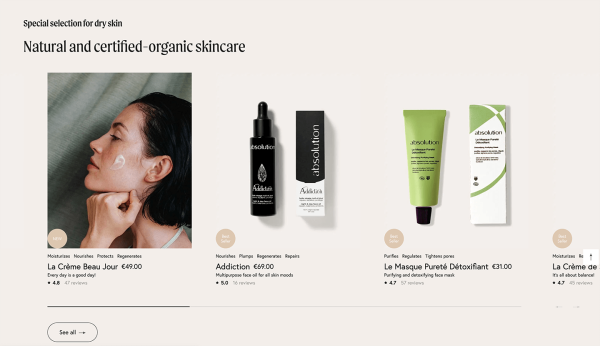
Absolution Cosmetics feature a horizontal slider for their products in their desktop experience.
3. Vertically-aligned menus
For decades, everyone has defaulted to using a horizontal menu on their websites. This is rapidly changing as a whopping 68% of users visit websites through their mobile phones. You might have noticed a growing number of ecommerce websites with vertically aligned menus.
Through unconventional layouts, industry-leading businesses are breaking the mould to present fresh new experiences to their customers. When executed well, these result in markedly increased engagement rates, longer sessions and better brand connection.
4. Minimalism
You know the saying that less is more. Minimalist design allows a website to hero their products more effectively without distraction. Minimalistic design allows your products to do all the talking. Picture Apple product photography and the simplicity of Google product campaigns. Intentionally bountiful white space. Flat neutral colours.
Alternatively, the embrace of minimalism in a user experience seeks to simplify user experiences in a more digestible linear trajectory. It allows the brand to control the storytelling, like how a museum is curated with a specific flow. With a lot of blank space on a wall, you are encouraged to focus on one piece at a time. A simplified user experience is a welcome breath of fresh air in protest of ‘choice overload’, a symptom prevalent in websites with jam-packed navigation menus, confusing nested dropdown menus and too many call-to-actions.
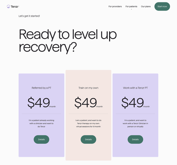
Tenzr has a lovely minimalistic design, with lots of white padding around their key headline, to give it ample focus.
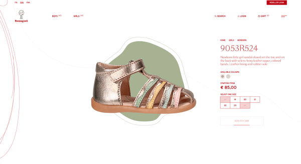
Romagnoli presents a minimalistic user interface on their product page to really hero their shoe
5. 3D Modelling
With the increased capabilities of technologies such as virtual reality (VR), brands have really been able to step up how they showcase their products.
Especially for eCommerce products that are innovative or unique, brands can utilise 3D modelling and videos to highlight the different build of their product or additional functionality that other brands lack. Although a potentially more costly route to implement, it will immediately set your line of products above the rest, in innovation and class.
3D is a great way to ignite excitement and bring awe to your brand, especially if your brand is techy, edgy, or modern.
6. Textured Backgrounds
Another visual design trend that complements minimalism well is the re-emergence of subtle textured backgrounds, aka ‘skeuomorphism’. Subtle textures and patterns that mimic real life experience add the sense of touch back to the flat online experience. It adds an additional layer of the missing sensation of touch and feel which consumers can experience in a 3D store experience.
In 2022, we expect to see more ecommerce websites bring more real-world textures to their designs, to add to the digital experience and keep it from feeling flat. Unlike the unrefined and slightly gimmicky methods when skeuomorphism was implemented in the early 2010s, ( wood-grain panels and fake-looking rain droplets), textures will be a lot more subtle, soft and refined.
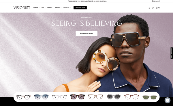
Visionist Eyewear uses texture in their header banner to add a sensory layer to their online experience.
7. Sticky Elements & Persistent buttons
While the number of customers shopping on their smartphones has long surpassed those on desktop, conversions on mobile can still be improved as more websites update their responsive experience.
In order to encourage smartphone shoppers to do this, we’re seeing more ecommerce sites incorporating mobile app-like features. Since consumers already spend the majority of their digital time in mobile apps such as Facebook or Instagram, this type of interface and functionality simply makes sense.
Make Your eCommerce Site More Appy & User-friendly
- Use sticky elements such as persistent headers, bottom bars, floating buttons
- Make your CTA buttons full-width in responsive so it’s easier for users to click
- Use horizontal carousels to shorten length of your page
8. Sculpturesque Product Photography
When it comes to eCommerce product photography, there are two primary types of imagery – product shots and lifestyle images. Ideally, your website should feature both types to appeal to the feelings and logic of your customers, and ultimately increase conversion potential.
We mentioned minimalism in point number 3. In regards to minimalistic design, we are seeing a lot of sculpturesque styling in the lifestyle shots for 2022. Sculpturesque product photography is a modern-retro style as it takes inspiration directly from Bauhaus architecture and cubism paintings. It’s all about bold geometry, unique angles, and refined colour palettes.
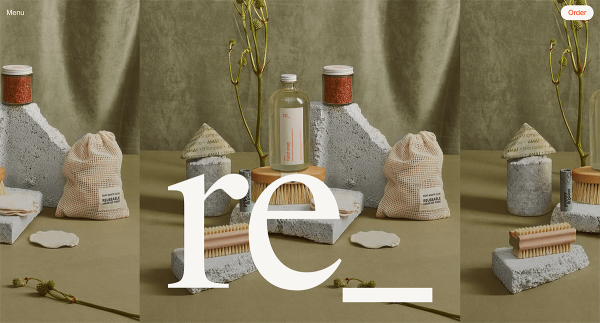
Here is an example of sculpturesque photography from the brand Regrocery
9. Lazy Loading
Lazy loading is a functional technique that is here to stay, beyond 2022. As websites are storing more content, featuring more effects, more graphical elements and third-party integrations, it is becoming more imperative to implement development strategies that do not slow down the website user experience.
Whilst not necessarily new, lazy loading is fast becoming more widely implemented. The approach is also popular with long one page social media and eCommerce apps which use infinity scroll such as Facebook, Instagram and ASOS.
Lazy Load ensures the web browser will prioritise downloading the content you see on the screen, without wasting server resources and time to load offscreen content that is not yet needed.
Looking at studies on scroll depth, many website visitors do not reach the bottom of a webpage. So why load that content and increase site load times?
10. Micro-animations and micro-interactions
With so much time spent online, and with so many websites out there, users are expecting more and more from their eCommerce shopping experiences. The need and appreciation for micro-animations and micro-interactions is surging.
Micro-interactions are small animations that offer subtle feedback to users.
Examples of micro-interactions
- When a link changes colour when a user mouses over it
- When a button pulses after it has been clicked
- When an image gets bigger when a user hovers over it
As you might have guessed from the name, micro animations are small animations. Micro animations are extremely helpful when it comes to holding a user’s attention and keeping them on the line as it takes your website time to load a page or respond to their activity.
Example of micro-animations
- The buffering animation when a page is loading
- The animation of a loading bar filling up after a button is clicked
- Animation of a cart wiggling after an item has been added
The combination of these 2 are powerful in increasing the user experience for consumers as each website tries harder to compete for attention. These small signals bolster reassurance in users that the website is indeed working and responding and they’re more likely to continue interacting, in a positive feedback loop.
Our Final Thoughts
Retail ecommerce website design trends are shifting constantly, and if you don’t stay in tune, you can soon find them alien. We hope you enjoyed reading and refreshing your mindset in what’s happening in the world of ecommerce.
If it’s been a long time since your website has had a professional tune-up and you’re a little embarrassed about how it compares to your competitors, you’re in the right place.
Feel free to reach out to our team of dedicated designers and developers on 03 9912 6403 to see what small or big tweaks your website will benefit from, to help your customers better connect with your brand, and see more sales through your online portal.