


30 May 23
Web Design Agency Learnings From Designing Manufacturers/Construction Industry Websites From The Last 14+ Years
For the last 14+ years, we’ve worked with a range of manufacturing/industrial B2B companies, from businesses that have been running for a couple of years to multi-generational family businesses that have been around for over 100 years.
We’ve built a wealth of knowledge and laser focused insights and wanted to create a pillar article summarising our overall observations and key common problems. We acknowledge that with NDA’s signed and respecting our clients privacy, we’ve done our best to summarise our learnings and results in a way that is meaningful, respectful and accurate.
In fact, some of these learnings have got us these results across the board:
- +30% increase in new leads in just 6 weeks of launch – B2C business
- 408% increase in conversion since launch – B2B service business
- 4x greater user engagement on the day of launch (with no additional marketing spend)
- +181% increase in conversion off a high base – established manufacturer
- +40% increase on leads with a simple 1 page UX/UI revamp – B2B service business
- New high quality lead received within less than 5 hours of launching new site – service business
These problems have helped our clients to help increase revenue, optimise marketing budgets, reduce marketing wastage (given that a lot of our clients are both in the B2B lead generation space (or what we call transactional conversion) but also have long tender processes (which we call relational conversion).
In fact, most of our clients have taken our website conversion frameworks and strategies (also taken from our book Stop Losing Leads) and have been used not only to improve the website but also our client’s sales proposals, and overall optimize their sales process to help improve conversions.We’ve taken a compilation of manufacturing/industrial B2B sites and put together our findings. Combined with the 60,000+ websites analysed by our Founder, Director and Lead Conversion Strategist, Irwin Hau, since 2009…
1. Get Rid Of Poor Headlines & Generic Copy
Your website is the face of your business online, and the headlines are the first thing that your potential customers see. Generic headlines simply create a bland or poor impression, do not articulate your value well or work to set you apart from your competitors.
You want to make sure that these words don’t only reflect your brand personality but are attention-grabbing and memorable. Personable, conversational or even witty headlines can showcase your unique voice.
It’s important to be smart with your website copy.
Web user analysis research shows that visitors nowadays prefer to scan and skim through content. I’d recommend making sure every headline on your landing pages packs a punch.
Great headlines will fulfil one of these key purposes
- Start a conversation and build a relationship
- Educate and inform
- Pose a question and challenge the status quo
- Highlight and impress
Let’s explore some real examples.
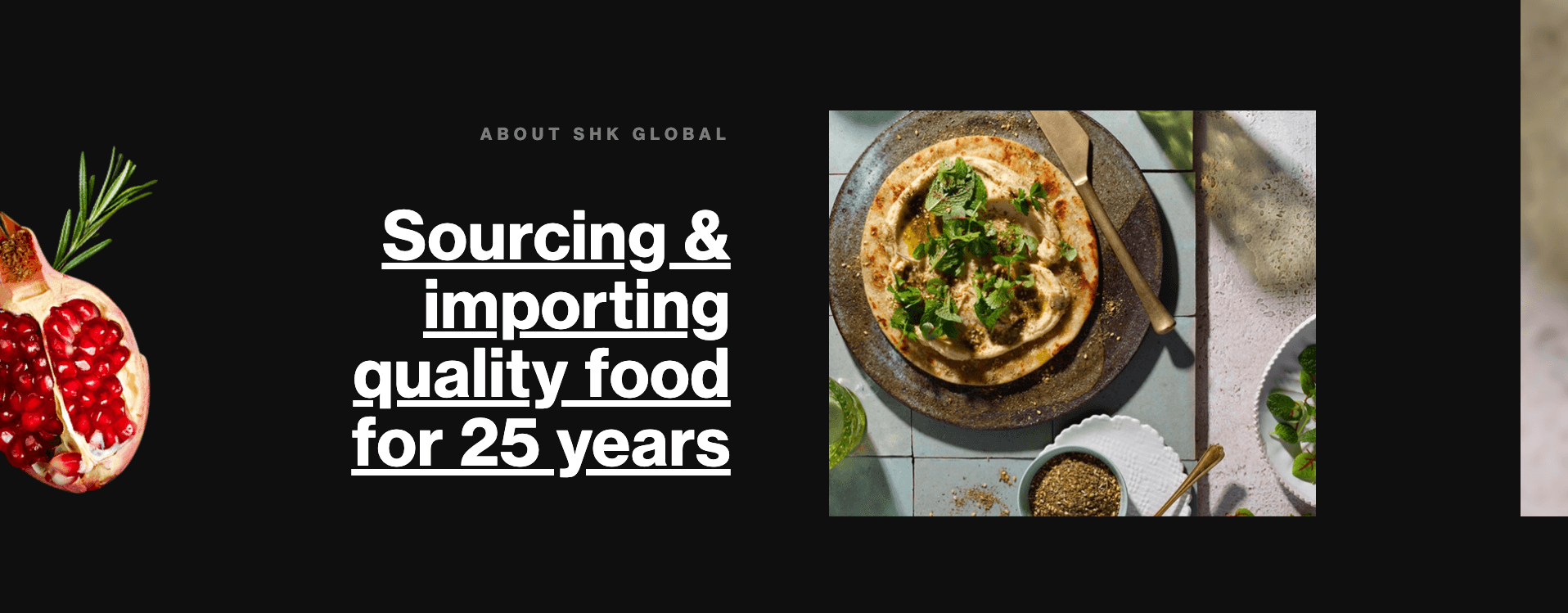
Example 1. For a more powerful connection between your brand and visitors, we suggest using longer headlines with 5 or more words. While conversational copy takes up more visual real estate, this storytelling approach has been proven to be more effective in creating a relationship with your visitors, faster.
Our client SHK Global adds some personability to their brand with “Sourcing & importing quality food for 25 years”. This is much stronger than generic language like “Our Story” or “About Us” which you will have seen peppered across hundreds of other websites.
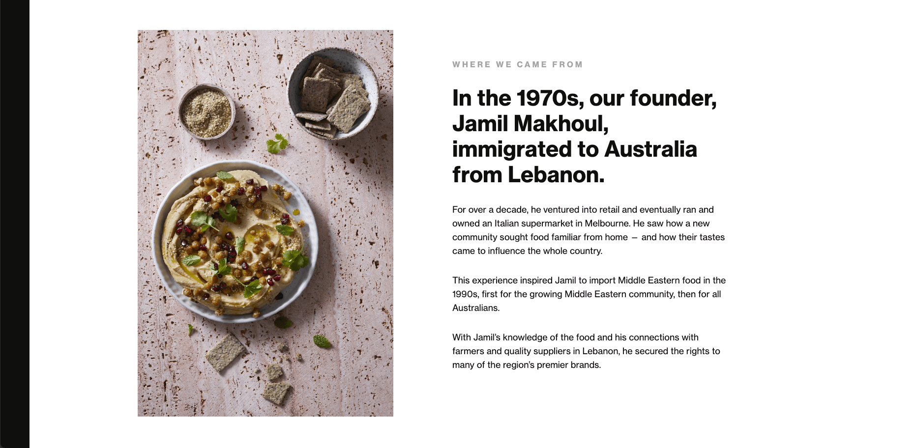
Example 2. Headlines that read ‘About Us’ or ‘Our Story’ are extremely overdone. Lacking in any flavour or doing absolutely nothing to elevate your brand. Good conversations are the starting point for establishing a relationship. Writing with a storytelling tone enriches your brand story and humanises your service. This helps to increase the perceived value and experience of your business.
Our client SHK Global adds heart behind their service, with a more personal headline, “In the 1970s, our founder Jamil Makhoul, immigrated to Australia from Lebanon.” This gives their brand authenticity and builds a more empathetic relationship with their customers.
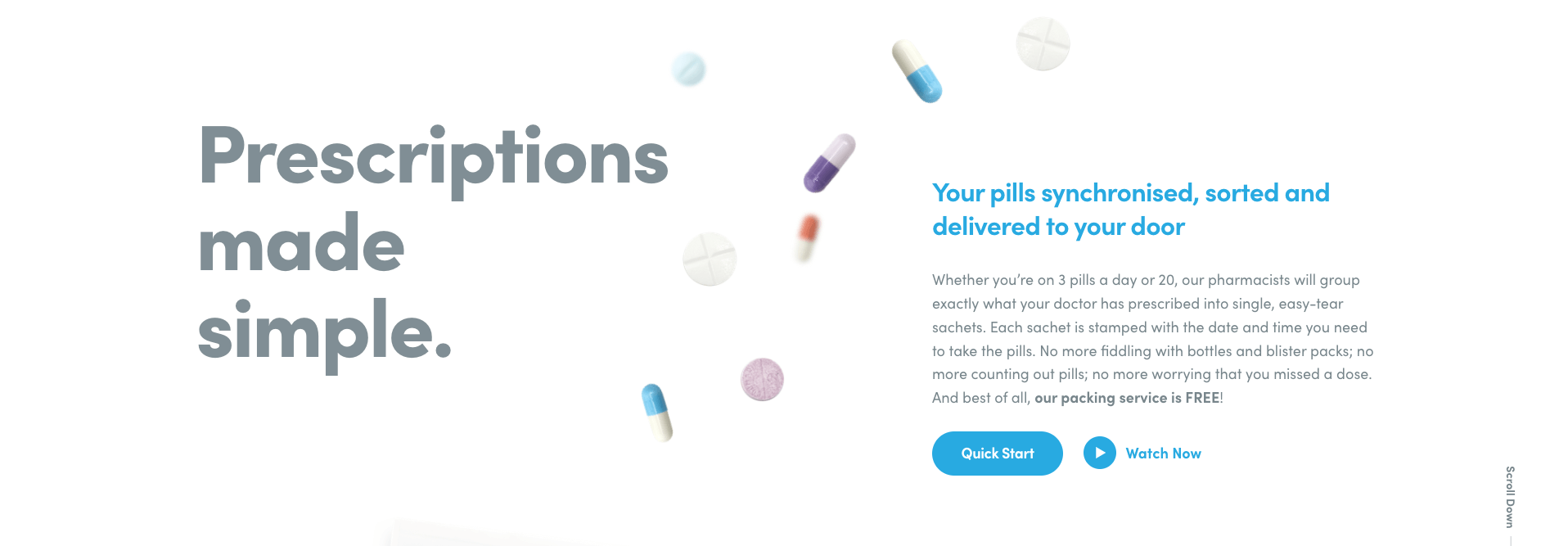
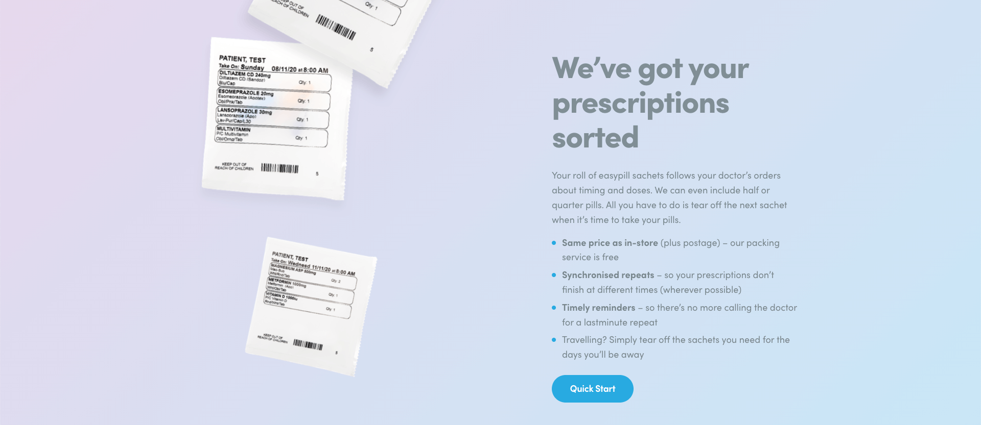
Example 3. We find a lot of businesses with copy focused on themselves, their own brand story, accreditations, team achievements or company awards. Whilst these are important, remember that your website is primarily there to serve your customers.
Acknowledging their pain points and frustrations are important in developing a closer relationship with them. Help them understand how they benefit from choosing you.
Our client EasyPill does just that with headlines that focus on the customer, “We’ve got your prescriptions sorted.” With the same price as in-store, synchronised repeats, timely reminders, and delivery, the customer can see how EasyPill will streamline their medication needs.
2. Replace Generic Imagery With The Real You
One critical aspect of your online presence is the imagery used on your website. Real, authentic imagery on your website plays a crucial role in establishing trust and promoting authenticity.
Today’s savvy web users can easily differentiate between stock images and genuine ones, and using stock images can make your business appear generic or insincere. By contrast, real images display transparency, fostering a sense of trust among your clientele, and help to establish a unique brand identity that separates you from the competition.
Real photographs also facilitate deeper customer engagement by narrating a unique, emotional story about your brand, products, and team. This transparency can help build trust with your customers.
Authentic imagery will build
- Trust in your brand
- A more unique brand identity
- Deeper relationship with your customers
- Quality assurance
- Perceived capability in your team
Showcasing your actual products offers quality assurance to your customers, while featuring your staff adds a personal touch to your brand, establishing a closer connection with your audience. Investing in real imagery, despite the greater effort required, significantly elevates your brand, your credibility and the perception of your service.
Let’s explore some real examples.
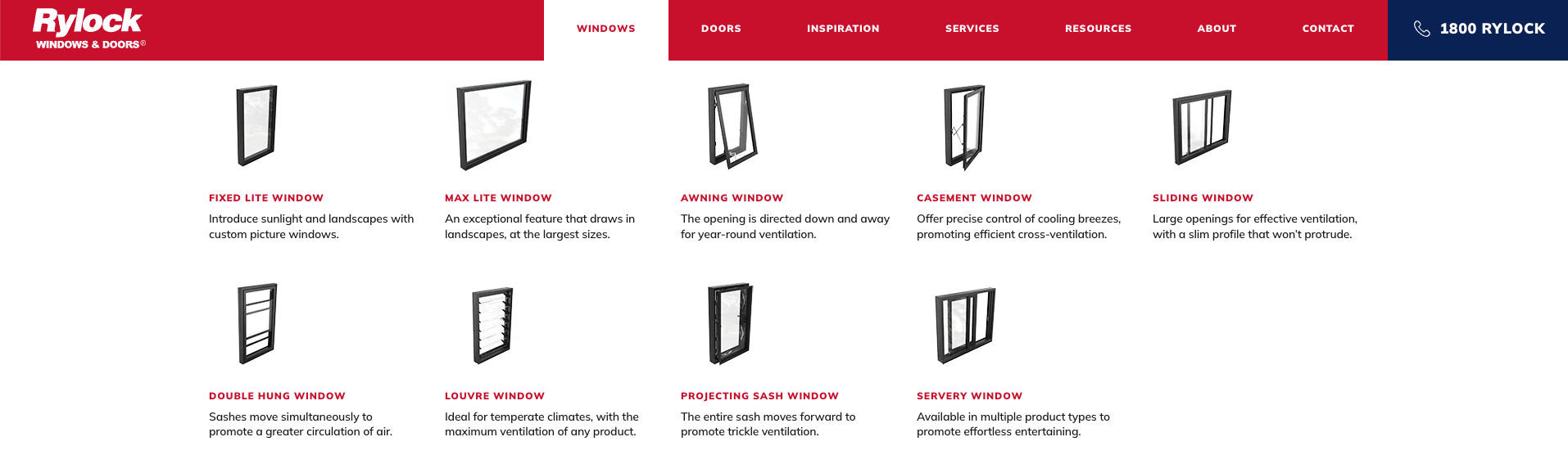
Example 1. Menus are traditionally very text-heavy areas. Injecting real imagery into your menu helps impress users, early into the user experience. With short attention spans nowadays, this is an absolute win. We recommended a visual menu for Rylock to showcase the products and also reduce confusion for their clients, as their innovative products have unique names.
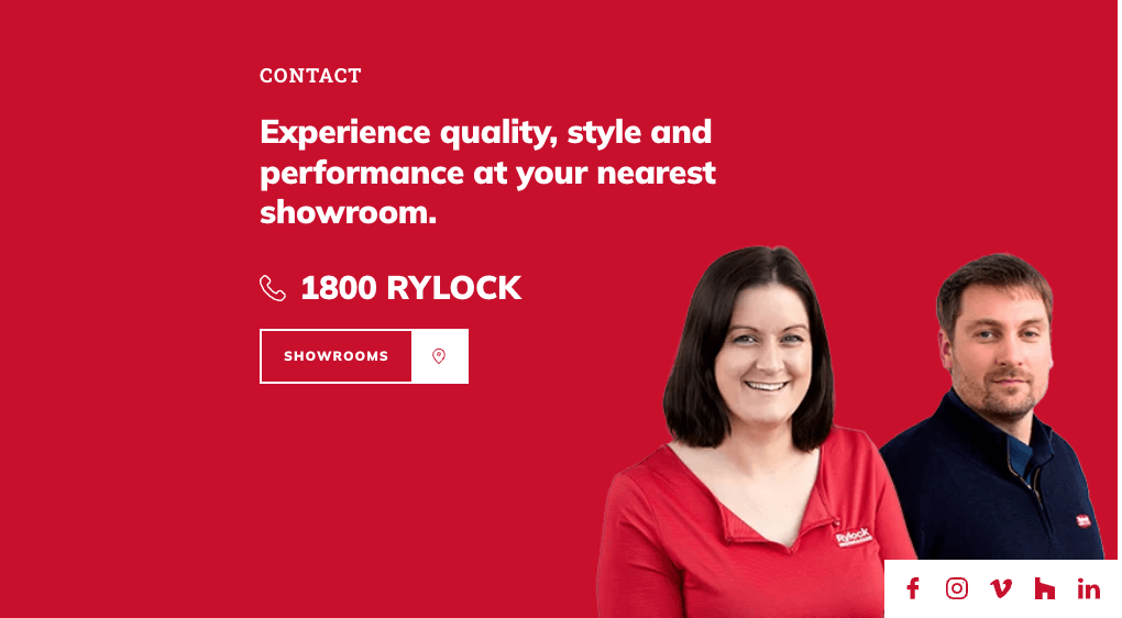
Example 2. Web users will do anything to avoid unreliable or offshore businesses, so every little signal that establishes credibility and trust is crucial. That’s where the use of real people and staff on your website becomes a game-changer.
The authenticity of having real people behind a business inspires a sense of ease and transparency – two qualities that are crucial for establishing long-lasting connections between businesses and customers.
Our client Rylock was able to invest in a photoshoot with their staff. With their smiling faces and a uniform, Rylock helps their web visitors put a face to the message and reduce a sense of risk.
Example 3. For businesses who want to establish a strong brand presence, consistent use of branding colours across their website and products is a surefire way to make an impression.
These colours should not only be striking but also create a unique identity that customers can easily recognize. Take Cadbury purple, for instance. This iconic shade has become synonymous with the company and its products. For our client TTI, we achieved this with the use of colour text blocks and accents of their branding colour continued throughout their product photography. A simple colour palette is the recommended way to elevate your brand presence with confidence.
Example 4. Luxury brands know that they cannot afford to skimp on high-quality photography in order to truly showcase their brand.
Our client Faucet Strommen, a maker of luxury tapware features beautiful photography throughout their website, from the menu right down to the subpages. The professionalism is executed with incredible depth of field, soft focus and a monotonal colour palette. There are no harsh sun rays or cheap vignette effects here.
Elegant photography communicates a sense of luxury and sophistication in visual show and tell. Luxury brands must ensure that their photography is flawless, from the lighting to the composition, in order to help their clients feel it from the moment they land on the website.
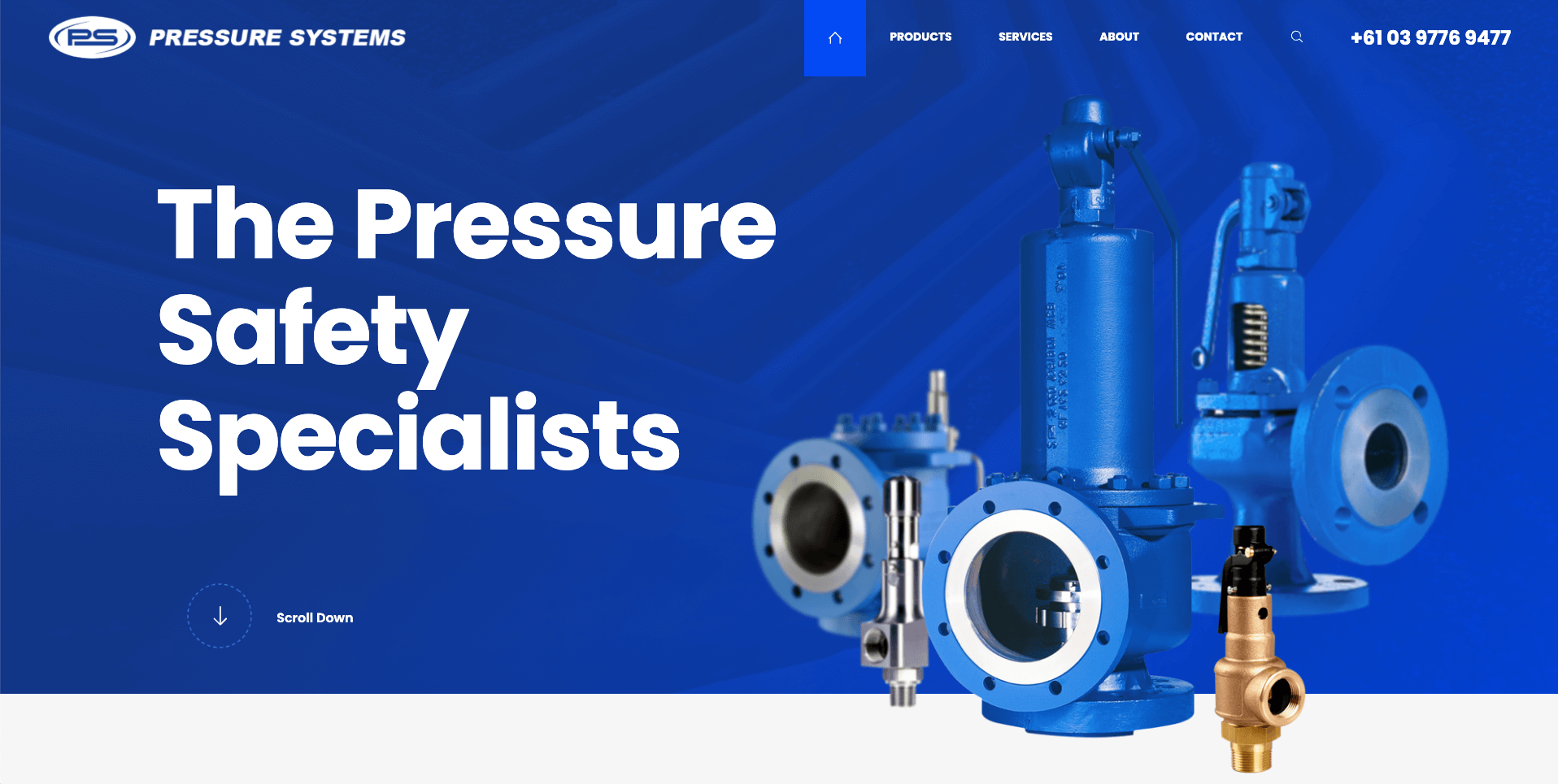
Example 5. It is rare to see great product imagery in the world of manufacturing, but our client Pressure Systems understood the value of stunning product photography. Our designer has used these visuals to make impressive first impressions for both existing customers and future prospects on their website.
Authentic, well-shot product imagery will elevate the value in your service and help you do business in the prize game, not the price game.
3) Try Not To Overwhelm Users With Too Much Content
Present-day web user reading habits and content consumption have come a long way since the advent of the internet. Long gone are the days when we’d scroll endlessly through pages of irrelevant content or take the time to read a full article.
In today’s fast-paced world of mobile devices, voice assistants, and social media, attention is the new currency. The intent behind each search and web session is a lot more focused. This is especially true for website visitors, who spend less time on each website visit.
Too much content can be overwhelming and ultimately drive users away.
In order to keep users engaged and help their experience stay targeted, it’s essential for your website content to be punchy, clear, and concise.
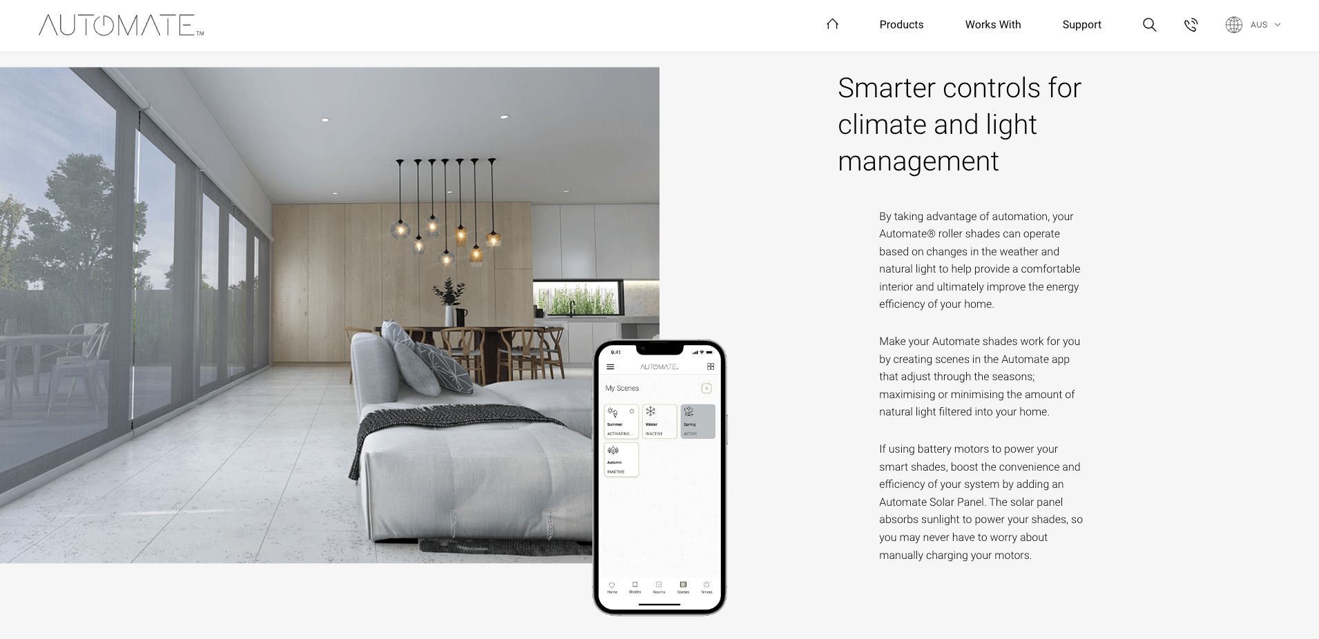
Example 6. In today’s world of constant information overload, it’s important to keep things simple and easy to digest. Reading from edge-to-edge of a laptop screen can be exhausting, and users can feel overwhelmed when confronted with a wall of text. Shorter paragraphs with thinner content widths make it much easier for users to skim through and find the information they need.
With our client, Automate Shades, the strategic use of white spacing creates a more focused experience, as it gives some breathing room and allows the content to take centre stage. When it comes to creating engaging and easy-to-read content, keep it short and simple.
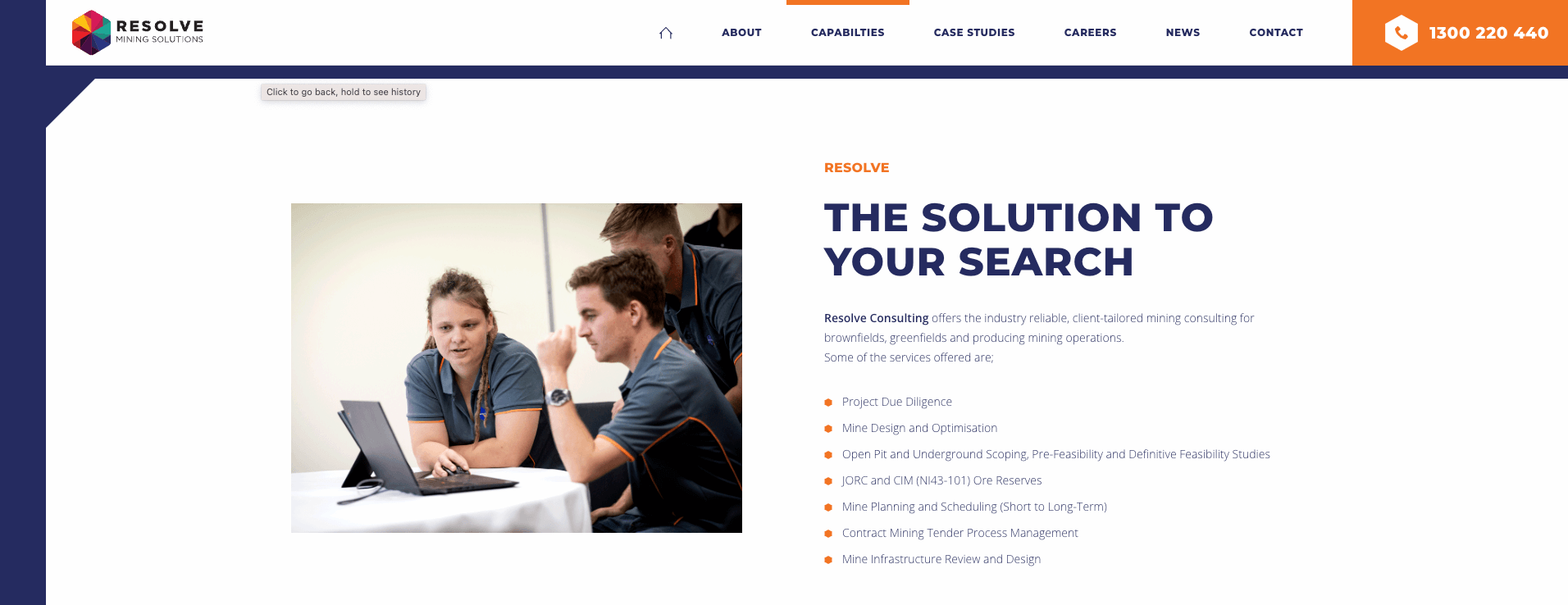
Example 7. The most recent web data shows that users prefer to skim and scan content, rather than read through it all. To cater to these new content preferences and keep up the user engagement, we encourage featuring bullet points in your web copy.
Like our client Resolve Mining, by swapping out long chunky paragraphs for a few bullet points, you can improve the scannability of your content and keep users staying and scrolling further on your page. Improving factors like scroll depth and session times for each website visitor can all collectively contribute to better Google rankings and your chance of coming up on the first page of search results.
4) Limit Your Choices & Keep Users Focused
Having choice is an empowering, wonderful thing. However, too many options can also lead to a phenomenon known as choice overload, where users become paralyzed by decision making, leading to frustration and a mindset to revisit the website later. This decision fatigue can cost your website a sale, a booking as there is a chance they won’t return.
The key to reducing choice overload is pretty simple. By reducing options and prioritizing the most important choices, users can navigate the site easier, leading to a better user experience.
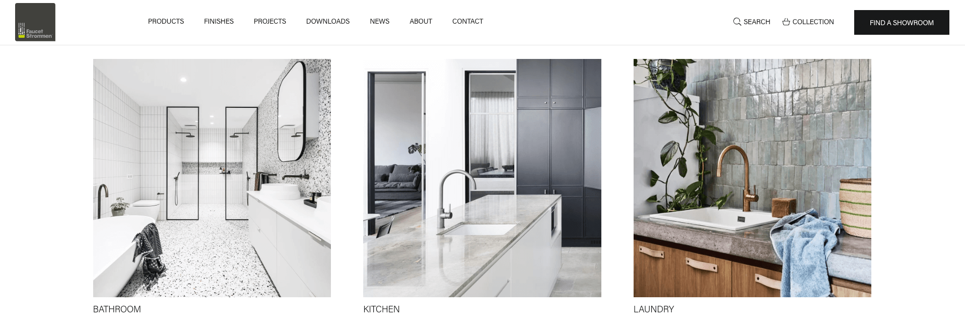
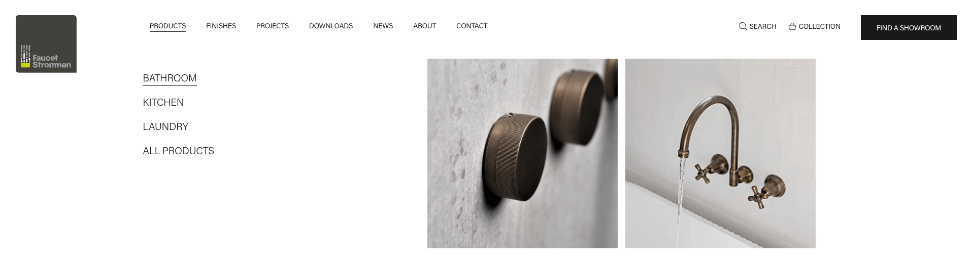
Example 8. Having 2-4 options at a time is the prime zone of choice. Our client Faucet Strommen preemptively anticipates their clients’ needs and only focuses on 3 specialty rooms, the bathroom, the kitchen and the laundry. Users can quickly direct themselves to their needs and get excited about the renovation they have in mind.
By removing distracting categories such as “Garden” or “Bar”, we keep the user journey much simpler and targeted. Where we can, we continue the momentum, helping the user stay interested.
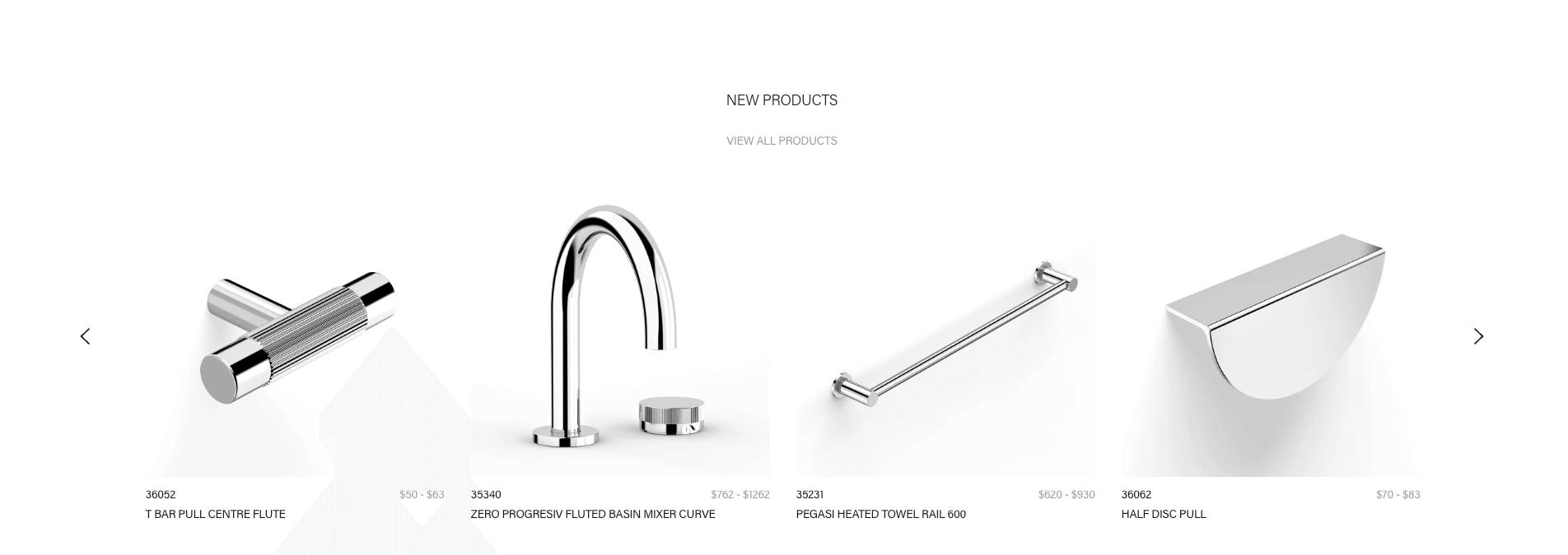
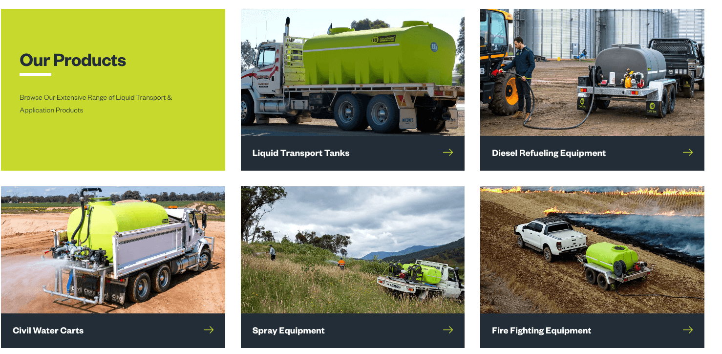
Example 9. There are times where you want to give your client more choice. This 4 column slider design gives you the flexibility of many more options, again without overwhelming the user.
This full-width design gives each product more visual real estate and lets it do the talking. Product names are much smaller in regards to visual hierarchy., taking on the backup dancer role and not distracting the user with complicated product names, at this stage of the user journey.
5) Don’t Make Your Pages Too long
The age-old saying goes, “content is king.” However, in today’s world of increasingly short attention spans, lengthy blocks of text with lots of details are ineffective on websites. As websites are often the first point of call in a typical sales funnel, brands should just be focusing on making a really good first impression and establishing their credibility. Placing too much information too soon can be a critical mistake as we can lose potential readers to overwhelm.
Endless scrolling should only be reserved for eCommerce experiences, particularly in apps such as ASOS and The Iconic. Your users are typically searching for a specific service or product or answers to a specific question. It’s much better to ensure each page can answer that specific need, and only featuring content relevant to that.
Don’t make the mistake of trying to answer multiple questions and needs on one page. It will be confusing and when thrown off, most users do not have the patience to explore to the end of the page.
Stay Tuned For More Expert Tips
Crafting the perfect website is undoubtedly a daunting task, but we have (hopefully) made that process a bit easier. It’s a busy time in our agency, especially at this time of year but it remains an utmost priority to us, to educate and help small businesses in the digital space. Continue to watch this space for more expert learnings and tricks.
Whilst we’re away, remember to focus on visual design, psychological triggers, and proper development to create an aesthetically pleasing yet effective website.
Effective web design should look amazing and also offer something of value to the visitor. To stand out from your competitors, you need to be able to provide an outstanding user experience, with the tips above, you have acquired some know-how to do just that.
Do You Want Help Now?
If you have found this article useful, and would like real guidance now, feel free to reach out to our wonderful team of website designers and developers at Chromatix on 03 9912 6403. Whether you’re looking for web designing, hosting ,developing and optimising, we are ready to do some heavy lifting for you (the digital kind).
