


12 Jul 13
Responsive Web Design Sucks: Plugins, Shims & Polyfills
 Websites that magically adapt to the user’s screen size, who wouldn’t want that nowadays? Especially since Samsung and Apple’s never ending release of awesome new gadgets with various device screen sizes. Our six part series for responsive web design is nearing the end with our fifth post on responsive web design plugins, shims and polyfills. Responsive web design sucks from the perspective of the designer/developer since it adds another layer of complexity to any website, but there are some plugins that make our lives easier. Minimum fiddling around and maximum results, time is money and efficiency shouldn’t be at the cost of effectiveness! Check out some of our favourite responsive web design plugins, shims and polyfills.
Isotope
This jQuery plugin rearranges elements for magical layouts. With different layout modes, filtering and sorting. Really powerful plugin and the commercial licensing is tiny for the amount of time you will save when building a responsive site. 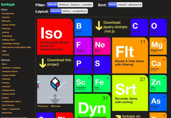
Overthrow
A lightweight JavaScript that solves the use of CSS overflow due to its bugs and issues in many browsers, particularly mobile browsers. This is a framework-independent, safe for form elements plugin that is free to use. 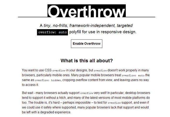
Responsive Nav
We highly recommend this plugin, fomerly TinyNav.js by @viljamis this simple responsive navigation plugin converts navigation elements to a selectable dropdown for smaller screen sizes. This JavaScript plugin is tiny and does not require any external libraries. 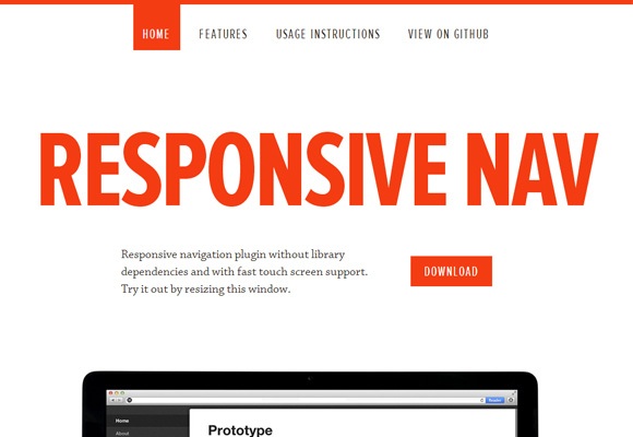
Masonry
Another JavaScript plugin, this one is a grid layout library that places elements in optimal position based on the available space. This is similar to Isotope, but is especially useful for cascading grid “masonry” layouts. 
FitVids.js
Have a video on your responsive website? This easy to use, lightweight jQuery plugin by Chris Coyier and Paravel will do the trick! 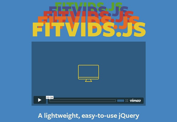
Woodmark
The Woodmark jQuery plugin is likely the most appropriate plugin when arranging images in columns. It was released due to the popularity of this type of responsive image layout as seen on woodmark.com. 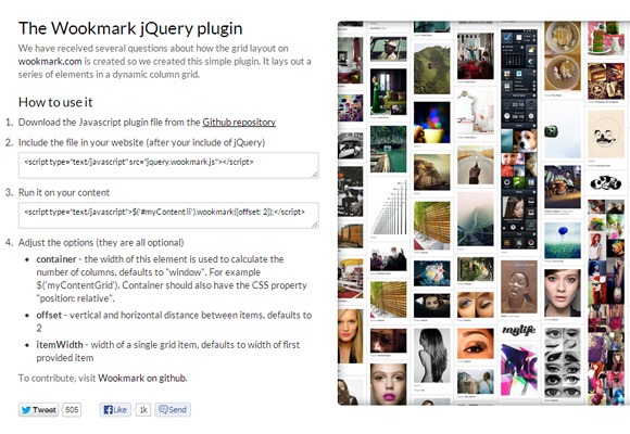
Adapt.js
CSS media queries are great, but the @media approach does not work for all browsers. This JavaScript plugin determines which CSS file to load before the browser renders a page. 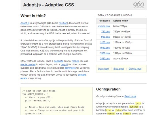
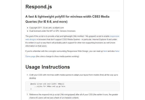
Respond.js
Internet explorer 6 – 8 are notorious for being web designer and developers’ nightmare. These browsers do not support media queries and respond.js JavaScript plugin is the perfect remedy.
 Plugins!
We love plugins, developing responsive sites is definitely much faster with many of these. Any of your favourite responsive web design plugins that we’ve left out? Let us know!