

We help businesses stand out, so they significantly increase their chance of converting more leads

Website UX Audit Services Melbourne
Website UX audits for clearer & stronger journeys
A website UX audit helps reveal where visitors are getting confused, stuck or distracted before they take action. It gives your team a clearer view of the experience people actually move through, not just the website you intended them to see.
At Chromatix, we audit website UX around user behaviour, page structure, navigation, content flow, CTAs, mobile usability, forms, trust signals, speed, accessibility and conversion pathways. We look for the moments where people may hesitate, lose confidence or leave because the next step is not clear enough.
For some businesses, that means reviewing a service website before a redesign. For others, it means auditing landing pages, forms, product journeys, booking paths, lead-generation pages or content-heavy websites that need better structure. The outcome is a website UX audit that gives your team clearer priorities, sharper recommendations and a better path towards website improvement. Let’s find the friction points stopping visitors from moving forward.
Website Ux Audit Testimonials
With over 166+ 5 star Google reviews & proven results since 2009

You’ve taken tech and made it so simple for us to understand. It’s been the perfect synergy of Chromatix understanding our complex needs and delivering with absolute perfection and professionalism!
Jacques Calais - Adventist Schools Australia

Our website conversion was decent before, but we’ve now even increased it by 50%! Our page speeds are also 7X faster, which helps our SEO. What we’re also seeing now is higher-quality leads. We’ve also improved our recruitment as the website better represents who we truly are. We are super proud of the website.
Luke, Tyler, Ashley & Steve - Shore Hire
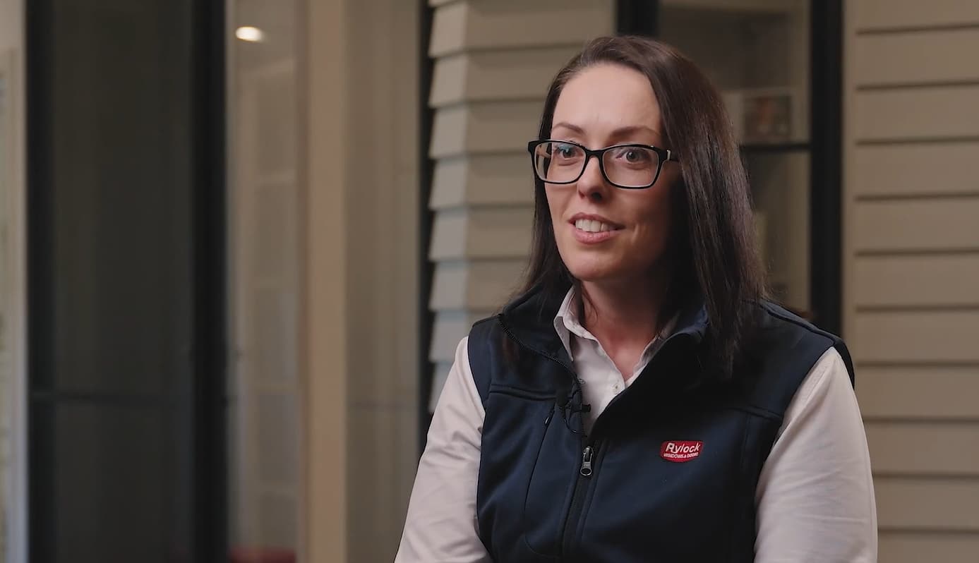
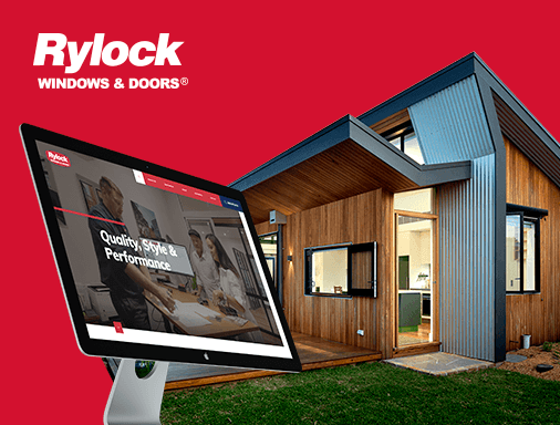
Our website is our greatest marketing asset. It was important that we had a trusted partner like Chromatix to assist us in delivering a growth strategy. We’ve now seen a 3x increase in traffic, an increase in user time on page & as a result, an increase in conversions & sales. We can certainly say hand on heart that our new website with Chromatix was pivotal to our recent growth!
Emma Truong - Rylock Windows & Doors

Chromatix saved us $15,000-$20,000 a year on wasted marketing spend & we also had an increase in the number of calls and enquiries just from the launch of the new website.
Steph & Alex - Resi Body Corporate

You were able to tell us multiple ideas straight away that helped us go from good to great, and you worked seamlessly with our team. Chromatix really understood our customers and our brand. Working with you was brilliant!
Mark Butler - Waterman Business Centres

Chromatix taught me the true power of mastering attention to increase our chance of winning tenders. I now know it 100% works because of the feedback we’ve received from clients and the industry. As business owners, we’re always conscious of what things cost. The question I asked myself was, what’s the true cost of not improving my website?
Robert Krastich - Sharper
Web Design & conversion Highlights
Websites that
build trust instantly












Website UX Audit Features
Website UX audit that show what needs to change
A strong UX audit should give your team more than a list of opinions. It should show where the website experience feels unclear, where users may be losing momentum and which improvements could make the biggest difference. We audit websites with a practical focus on clarity, trust, usability and action.
10x clearer user journeys
Visitors need a path that feels simple to follow. We review navigation, page flow, internal links, CTAs and key decision points to find where the journey becomes harder than it should be and make sure its consistently efficient.
Page structure review
Strong pages need a clear order of information. We assess hero sections, overview content, proof points, service explanations, FAQs, forms and CTAs to see whether the page builds confidence properly.
Mobile UX checks
Mobile visitors need fast, readable and tap-friendly experiences. We review spacing, menus, buttons, forms, sticky actions, content flow and key pages across smaller screens.
Content clarity & readability
Website copy needs to guide people, not make them work harder. We review headings, paragraph flow, language clarity, scanability, content hierarchy and whether key messages are easy to understand.
Trust signal placement
Trust signals work best when they appear near moments of doubt. We assess testimonials, case studies, client logos, results, reviews, guarantees and reassurance content across the user journey.
100% focused on practical next steps
A UX audit should help your team act, not just observe. We turn findings into clear recommendations so you know what should change, why it matters and where to start.

Website UX Audit Strategy & Methods
Website UX audit built around real user behaviour
The best website UX audits start with the journey people actually need to take. Before reviewing pages, we look at who the website needs to support, what users are trying to understand and which actions matter most for the business.
That matters because website problems are not always obvious from the surface. A page may look polished while visitors still struggle with unclear next steps, weak trust signals, confusing navigation, long forms, poor mobile flow or content that does not answer the right questions quickly enough.
Our method brings together UX, UI, content structure, accessibility, speed, analytics and conversion thinking. We shape the audit around practical findings that help your team understand what is creating friction, what should be improved first and how the website can become easier to use.
Website UX Audit Delivery
Website UX audit built for practical recommendations
A website UX audit needs to be clear enough for your team to understand and useful enough to guide real improvements. We turn website observations into structured findings, prioritised recommendations and practical next steps, so your team can make better decisions before a redesign, rebuild or optimisation project.
UX review with real context
We review the website through the lens of your audience, goals and key user actions. That keeps the audit focused on what the website needs to achieve, not just what looks wrong.
Priority scoring for easier action
Not every issue carries the same weight. We help separate quick wins, high-impact fixes, strategic changes and improvements so your team can act with more confidence.
Page-by-page findings
Important pages deserve specific attention. We review key service pages, landing pages, forms, homepage sections, product journeys or conversion paths depending on the website goal.
5-star recommendations summary
Your team needs clear direction after the audit. We summarise what matters most, where friction appears and which improvements should be considered first.
Design & development handoff
UX audit findings often need design or development support. We shape recommendations so they can be discussed, designed, built or tested with fewer gaps.
Work with the UX team from day one
No audit fog. You work with the people thinking through the website experience, so every recommendation is clearer, more practical and better aligned with real user behaviour.
Website UX Audit FAQs
Frequently asked questions
What does a website UX audit review?
A website UX audit reviews how easy your website is to use, understand and act on. It can include navigation, page structure, mobile usability, CTAs, forms, content clarity, accessibility, trust signals, speed and the key moments where visitors may hesitate or leave.
- Navigation checks reveal unclear user pathways
- Form reviews help protect enquiry flow
- Page structure shows where clarity breaks down
A good UX audit gives your team a clearer view of what users may be struggling with. Let’s find the website friction that needs attention first.
When should a business get a website UX audit?
A business should consider a website UX audit when enquiries are low, conversion rates are weak, users are dropping off, forms are not being completed or the website feels hard to navigate. It is also useful before a redesign, rebuild, campaign launch or major content update.
- Redesign planning becomes clearer with UX findings
- Low enquiries may point to hidden friction
- Campaign traffic performs better with smoother journeys
A UX audit helps you improve the website before investing more heavily in traffic or design changes. Let’s review what is stopping users from moving forward.
Can a UX audit improve website conversions?
Yes. A UX audit can improve website conversions by identifying the friction points that stop users from taking action. Clearer CTAs, better page order, simpler forms, stronger trust signals, faster mobile experiences and more useful content can all support stronger conversion pathways.
- Clearer CTAs make action easier to understand
- Better forms reduce completion friction
- Stronger trust signals reduce user hesitation
A UX audit gives your team practical ways to make the website easier to act on. Let’s turn confusing user moments into clearer next steps.
What pages should be included in a UX audit?
A UX audit should include the pages that matter most to user action and business outcomes. This often includes the homepage, service pages, landing pages, product pages, booking paths, enquiry forms, checkout pages, pricing pages or any page where users decide whether to continue.
- Homepage reviews show first-impression friction
- Service pages reveal decision-making gaps
- Form pages show action-point problems
The right pages depend on where visitors need the most confidence before acting. Let’s audit the journeys that matter most to your website.
How is a UX audit different from a website audit?
A UX audit focuses on how people experience and use the website, while a broader website audit may also cover SEO, technical health, speed, tracking, content and performance. A UX audit looks closely at clarity, usability, behaviour, friction and the path to action.
- UX audits focus on user behaviour
- Website audits can cover broader technical areas
- Both can support better digital decisions
A UX audit is best when you want to understand why users may not be moving through the site smoothly. Let’s review the experience from the visitor’s point of view.

Why Choose Chromatix for Website UX Audit
How professional UX audits improve websites
A website UX audit has a direct impact on how clearly your team can understand what is helping or hurting the user experience. Without a proper review, website decisions can become guesswork, based on internal opinions rather than the moments where visitors actually lose clarity or confidence.
Choosing a professional website UX audit agency gives your business a stronger foundation for user journey improvements, content clarity, mobile usability, form performance, CTA placement, accessibility and conversion-focused priorities. It means recommendations are shaped around real website behaviour, not surface-level design preference. Choosing a professional agency to work on the website UX audit of your website comes with key benefits:
- Clearer improvement priorities: Professional UX audits help your team understand which website issues deserve attention first.
- Better user journey visibility: UX review shows where visitors may be getting confused, distracted or slowed down.
- Stronger conversion pathways: CTA, form and page-flow recommendations can make important actions easier to complete.
- More useful redesign direction: Audit findings help guide redesign decisions before time and budget are spent in the wrong places.
- Better stakeholder alignment: Clear findings make it easier for teams to agree on what needs to change and why.
You get a website UX audit that feels practical, structured and built around how people actually use your website. Your team gains clearer priorities, fewer assumptions and a stronger direction for improving the digital experience.