


We help businesses stand out, so they significantly increase their chance of converting more leads
Responsive Web Design Services Melbourne
Responsive web design for smoother browsing & action
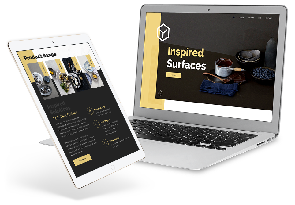
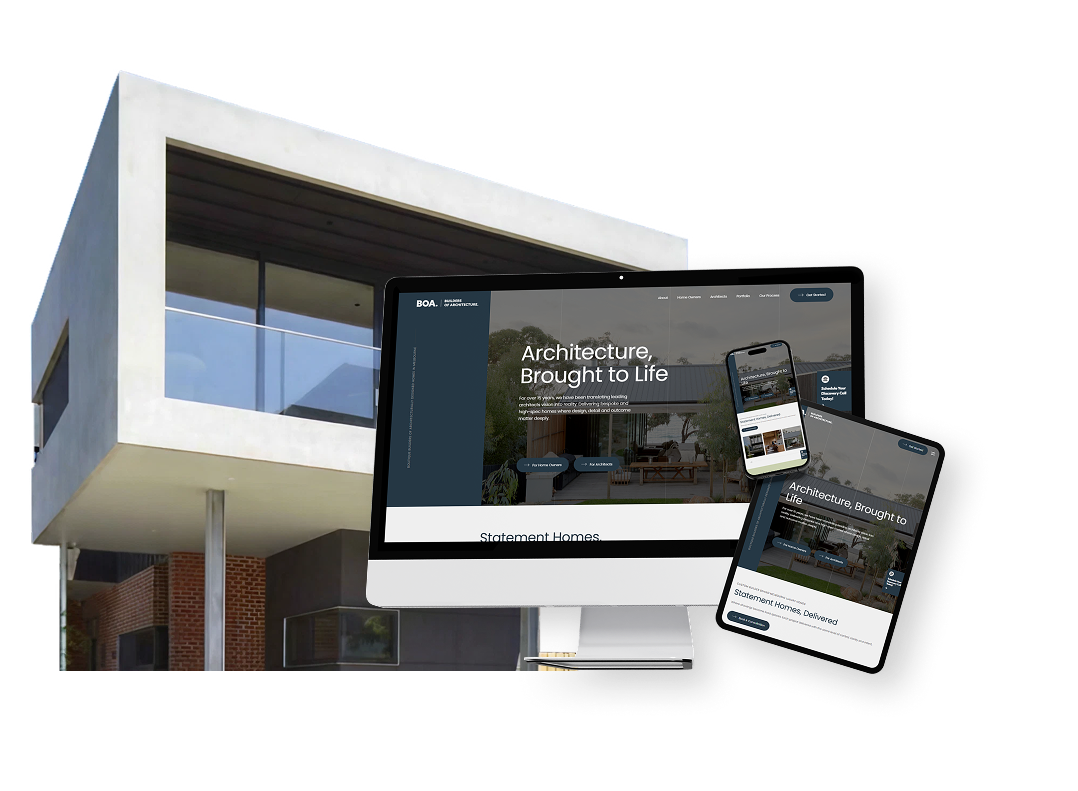
Responsive web design helps your website feel polished, clear and usable across every screen size. When visitors move between desktop, tablet and mobile, the experience should still feel easy to read, simple to navigate and clear enough to act on.
At Chromatix, we design responsive websites around real user behaviour, not just flexible layouts. We look at navigation, page hierarchy, tap targets, mobile CTAs, forms, image behaviour, content flow, speed, accessibility and the moments where small-screen users either keep moving or drop away.
For some businesses, that means rebuilding mobile page layouts, simplifying menus and strengthening key CTAs. For others, it means designing a full responsive website that keeps brand polish, performance and conversion quality strong across devices. The outcome is responsive web design that makes every screen feel considered, clear and ready for action. Let’s build a website that feels simple and easy to use wherever people find you.
testimonials & Responsive web design results From Clients
With over 166+ 5 star Google reviews & proven results since 2009

Our website is our greatest marketing asset. It was important that we had a trusted partner like Chromatix to assist us in delivering a growth strategy. We’ve now seen a 3x increase in traffic, an increase in user time on page & as a result, an increase in conversions & sales. We can certainly say hand on heart that our new website with Chromatix was pivotal to our recent growth!
Emma Truong - Rylock Windows & Doors
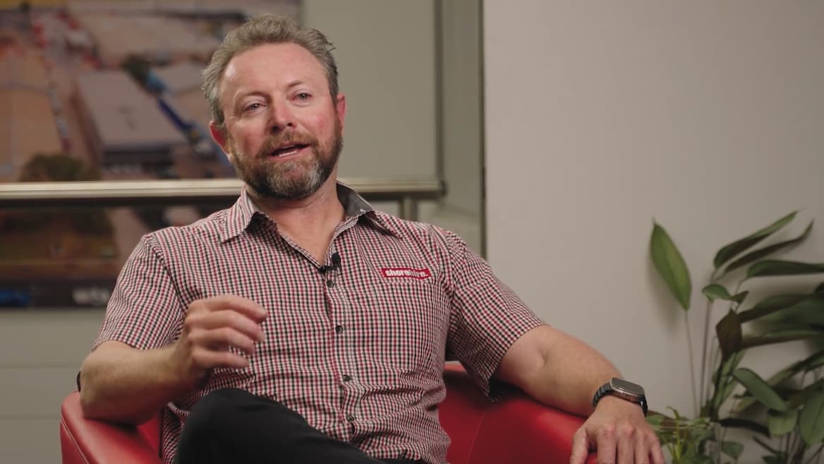
Our website conversion was decent before, but we’ve now even increased it by 50%! Our page speeds are also 7X faster, which helps our SEO. What we’re also seeing now is higher-quality leads. We’ve also improved our recruitment as the website better represents who we truly are. We are super proud of the website.
Luke, Tyler, Ashley & Steve - Shore Hire

Chromatix saved us $15,000-$20,000 a year on wasted marketing spend & we also had an increase in the number of calls and enquiries just from the launch of the new website.
Steph & Alex - Resi Body Corporate

You’ve taken tech and made it so simple for us to understand. It’s been the perfect synergy of Chromatix understanding our complex needs and delivering with absolute perfection and professionalism!
Jacques Calais - Adventist Schools Australia

Chromatix taught me the true power of mastering attention to increase our chance of winning tenders. I now know it 100% works because of the feedback we’ve received from clients and the industry. As business owners, we’re always conscious of what things cost. The question I asked myself was, what’s the true cost of not improving my website?
Robert Krastich - Sharper

You were able to tell us multiple ideas straight away that helped us go from good to great, and you worked seamlessly with our team. Chromatix really understood our customers and our brand. Working with you was brilliant!
Mark Butler - Waterman Business Centres
Responsive Web Design Focus Areas
Responsive web design that make every screen work harder
Responsive web design becomes stronger when layout, speed, content and conversion pathways are planned together. The aim is not just to make the website fit smaller screens. The aim is to make every device experience feel clear, useful and ready for action.
Instead of treating mobile as a smaller version of desktop, we look at how each device changes user behaviour. That means navigation, CTAs, forms and content flow are assessed through the lens of practical business value.
Mobile UX & page flow
Mobile UX and page flow help users understand the page quickly on smaller screens. We shape content order, spacing, sticky actions, navigation and page sections around how people scroll and tap.
Forms & conversion actions
Forms and conversion actions need to feel easy across devices. We assess field layout, labels, validation, tap targets, confirmations and CTA placement so enquiry paths stay clear.
Speed & responsive performance
Responsive performance helps keep users moving when attention is short. We assess images, code, scripts, loading behaviour and layout shifts that can affect mobile experience.
CMS & layout flexibility
CMS and layout flexibility help your team update content without breaking the responsive experience. We plan reusable sections, editing rules and content structures that hold up across screen sizes.
Responsive Web Design Features
Responsive web design that makes every screen feel easy
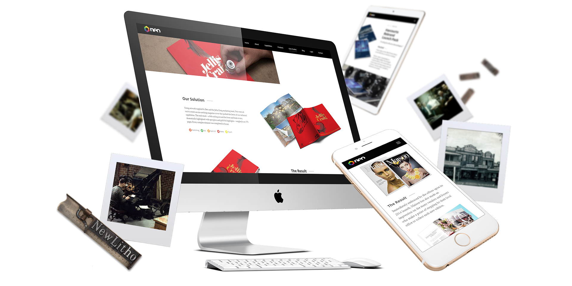
A strong responsive website should never feel like the desktop site has simply been squeezed onto a phone. It should rethink how people read, tap, scroll, compare and decide across different devices. We design responsive websites that keep the experience clear, polished and action-focused from the largest screen to the smallest.
10x clearer mobile journeys
Mobile users need fast clarity. We shape page order, content flow, CTAs and key actions so visitors can understand the page easily and move forward without awkward pinching, hunting or guessing.
Navigation that feels simple
Responsive navigation should help users find what they need quickly. We design menus, buttons, dropdowns, sticky actions and page pathways so browsing feels clean across desktop, tablet and mobile.
Layouts that adapt beautifully
Responsive layouts need more than flexible grids. We design section spacing, image behaviour, text hierarchy and content blocks so every page feels intentional on different screens.
5-star tap-friendly actions
Buttons, forms and interactive elements need to feel easy on touch devices. We design tap targets, spacing, sticky CTAs and form controls so mobile action feels smooth and obvious.
Content that stays readable
Responsive content should be easy to scan without feeling chopped up. We shape headings, paragraphs, bullets and visual rhythm so users can read quickly and still understand the value.
Accessible design for more users
Responsive design should also support better usability. We consider contrast, readable sizing, focus states, labels, navigation and plain-language prompts across screen sizes.
100% built around real device behaviour
Responsive design works best when it reflects how people actually browse. We shape the experience around scrolling, tapping, scanning, switching devices and acting quickly when intent is high.
Web Design & conversion Highlights
Websites that
make your phone ring








Responsive Web Development Features
Responsive web design built for speed, stability & control
A responsive website needs clean development behind the design. It should load smoothly, behave reliably and give your team flexible control without breaking the experience across screen sizes. We build responsive websites with careful front-end structure, practical CMS control, performance optimisation and testing that protects the user experience across devices.
Frontend builds with fluid polish
We develop responsive interfaces that feel smooth from desktop to mobile. Layouts, menus, cards, forms, animations and interactive sections are built to behave cleanly across every breakpoints.
CMS control without layout breakage
Your team should be able to update content without damaging the responsive design. We build flexible sections, reusable blocks and editing rules that protect layout quality after launch.
Mobile-first performance thinking
Responsive design and speed work together. We optimise images, code, scripts, layout behaviour and key templates so mobile users are not punished by heavy pages.
Clear build guidance from day one
No technical fog. We explain how responsive layouts, CMS control, performance and testing decisions support usability, conversion and long-term website quality.
Responsive Web Design FAQs
Frequently asked questions
How is responsive web design different from mobile-friendly design?
Responsive web design means the website adapts properly across desktop, tablet and mobile screen sizes. Mobile-friendly design usually means the site can be used on mobile, but responsive design goes further by shaping layout, spacing, navigation, CTAs and content flow for each screen.
- Responsive layouts adapt across screen sizes
- Mobile-friendly pages may still feel limited
- Better breakpoints create smoother user journeys
A strong responsive website feels designed for every device, not just resized. Let’s build a website that feels polished wherever people open it.
Why does responsive web design matter for conversions?
Responsive web design matters because users need to understand, trust and act quickly on any screen. If buttons are hard to tap, content is cramped, forms feel painful or the page structure breaks down on mobile, users are more likely to leave before enquiring.
- Clear mobile CTAs support faster action
- Better layouts reduce small-screen confusion
- Easier forms help protect enquiry intent
A better responsive experience gives visitors fewer reasons to stop before they act. Let’s make every screen support the next click more clearly.
Can responsive web design improve mobile enquiries?
Yes. Responsive web design can improve mobile enquiries by making key actions easier to see and complete. Strong mobile page flow, thumb-friendly buttons, simpler forms, readable content and faster loading all help visitors move from browsing to enquiry with less friction.
- Visible CTAs help users act sooner
- Mobile form design reduces completion friction
- Faster pages help keep attention alive
A strong mobile experience helps protect leads when intent is high and patience is low. Let’s make mobile enquiry paths feel simple, clear and worth completing.
How do you test a responsive website before launch?
A responsive website should be tested across key screen sizes, browsers, user journeys and page types. That includes navigation, forms, CTAs, content wrapping, image behaviour, spacing, loading speed, accessibility basics and conversion paths.
- Breakpoint testing catches layout problems
- Form testing protects enquiry pathways
- Mobile speed checks support user momentum
Proper testing helps make sure the website feels reliable before real users depend on it. Let’s build a responsive website that holds up when users start clicking.
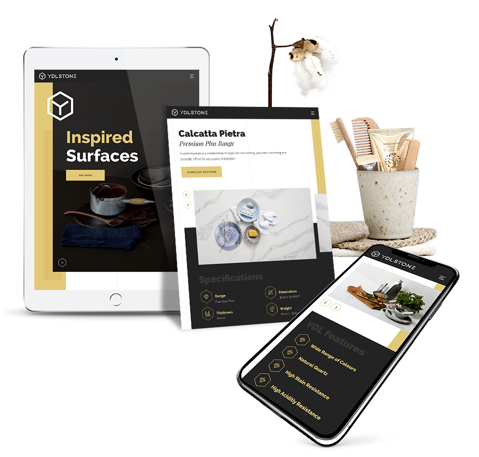
Why Choose Chromatix for Responsive Web Design
How professional responsive web design improves every website visit
Responsive web design has a direct impact on how easy your website feels to use across desktop, tablet and mobile. A weak responsive experience can make strong content feel cramped, forms feel frustrating and CTAs harder to act on. A professionally designed responsive website can make every visit feel smoother, clearer and more trustworthy.
Choosing a professional responsive web design agency gives your business a stronger foundation for UX, mobile usability, content hierarchy, speed, accessibility, CMS control and conversion pathways. It means the website is shaped around real browsing behaviour, not just resized after the desktop design is finished.
Choosing a professional agency to work on the responsive web design of your website comes with key benefits.
- Stronger mobile usability: Professional responsive web design helps visitors browse, read and act with less friction on smaller screens.
- Clearer conversion pathways: Better mobile CTAs, forms and page flow help users understand what to do next.
- More consistent brand trust: Strong responsive layouts keep your website looking polished across every major device.
- Better website performance: Responsive development can support faster loading, smoother interaction and better user experience.
- Easier long-term management: A well-planned CMS helps your team update content without breaking responsive layouts.
You get a responsive website that feels polished, practical and built around how people actually browse. Visitors can understand your value faster, move across devices with less friction and take action with more confidence.